Making the Most of a Bad Rental Bathroom – Part I
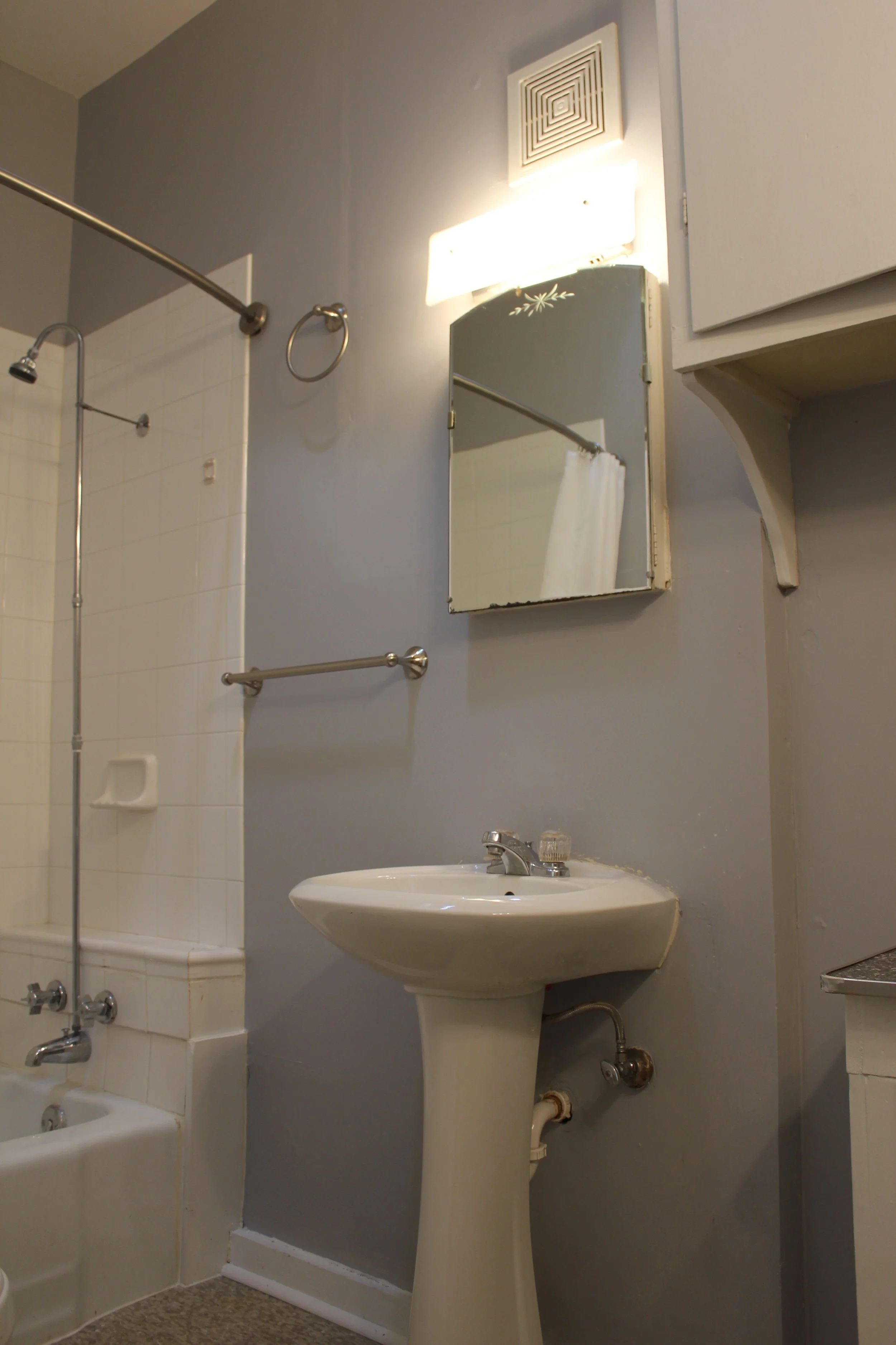
Four years ago, this was the first room I attempted to update upon moving in to our rental duplex. Having previously occupied a slew of apartments – all boasting charming vintage bathrooms, each cuter than the last – our good-fortune finally ran out. It's not completely horrific, and we're graced with a downstairs bathroom, so no one but Luke and I really have to see this one. But the reality is we use it all the time and the small cluster of sad design choices make it a big bummer.
It was the only room not already painted a bland buttercream when we moved in; instead, it touted an equally questionable homely brown and dusty lavender color scheme. The layout is fairly inoffensive, filled with run of the mill fixtures including a basic pedestal sink with that ubiquitous (i.e. cheap) faucet landlords just love throwing in all their properties. I do like the vintage medicine cabinet, though sadly it's not centered above the sink or inset in the wall. In fact neither sink, mirror, light, or vent are centered above one another.
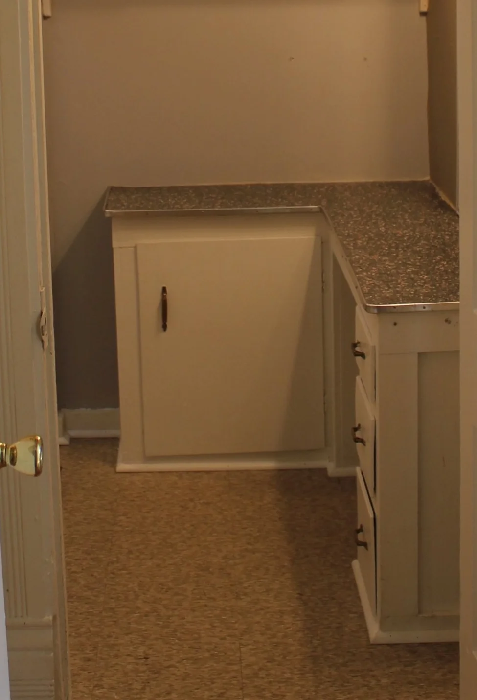
On the other side is an ad hoc vanity and storage solution (if you don't look too closely the two-by-fours and scrap lumber holding up a 50s formica top almost pass for proper cabinetry). The vanity itself is a great detail and super useful, though the dorm room mirror and off-centered light fixture weren't doing it any favors. Oh yeah and that weird faux marble piece of laminate below... what is happening???
But I really am so into that pink speckled formica. It's completely wrong for the era of the house, but Eeeek! It's just so cute!
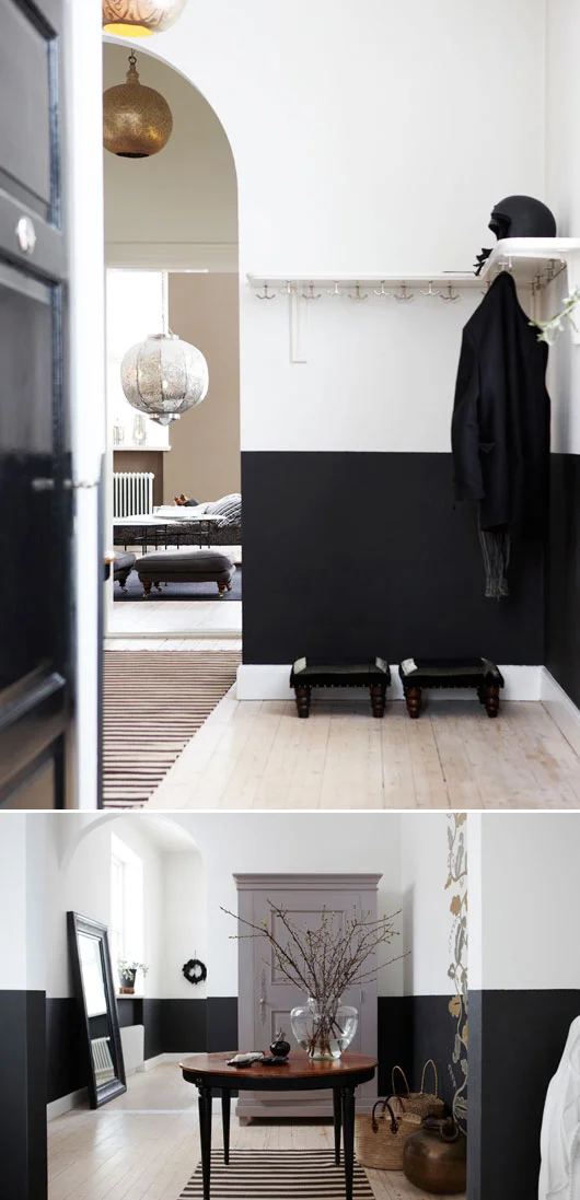
So right after moving in, awash with that new-home makeover zeal, I decided this was the room to focus my efforts. Figuring paint was the most important step, I spotted this image on sfgirlbybay and was all, two tone black and white walls, yes please. And actually, to this day I still find myself frequently referencing this image. There's something so classic about the black and white, and so clean and modern with the lack of a chair rail.
Then why did it take me four years to finally post about it?
It's all because of that infuriating beige floor. Despite my new paint job, actually probably because of it, those preexisting tiles made the room seem even more dingy and uninspired than it did to begin with. Something about the crisp/clean black and white just made them feel really dirty in contrast. Instead of receding into the background, they now became an unintended bland punctuation mark on an otherwise fresh and semi pulled-together room.
I spent so much time (read: years) trying to come up with affordable/reversible solutions for that floor. The rubber flooring in Daniel Kanter's Brooklyn rental kitchen was a strong contender. I just couldn't get beyond the $250 price tag. I thought about laying a sheet of laminate (using double sided carpet tape to temporarily affix it), or slapping some peel and stick tiles down and dealing with the consequences of resorting to a more permanent solution. But none of the available options felt appropriate for a late 1800s victorian bath (although most of the design decisions in here already don't, so I probably could've gotten away with it).
In the end I did nothing.
But recently, after years of frustration and avoidance, I decided to quit fixating on it, throw some rugs down, and just deal. This won't be a grand aspirational makeover – it's simply making the most of a bad rental bathroom – but despite the room's many remaining shortcomings I think I've incorporated a few ways to temporarily spruce up the lackluster space. Check back soon for the "after" photos.


