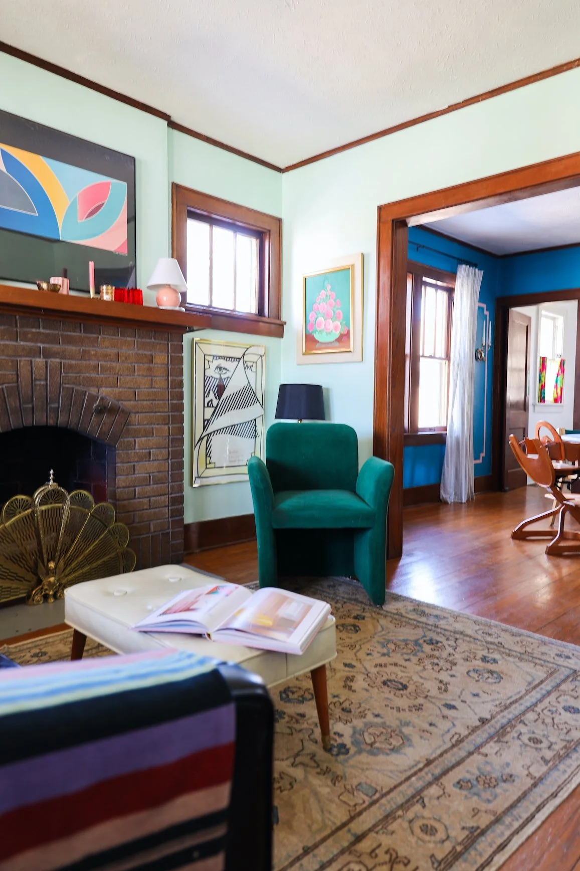
The Bungalow Living Room – an Update
All the cameos this room made during the dining room post proved it was time for an update! When we moved in two and a half years ago, our bungalow living room and dining room shared a sad tan color palette. I banished the bland by painting them both Mint Condition by Sherwin Williams. Of course, I soon discovered the light and airy mint read dull and lifeless in the North-facing dining room.
Luckily, it does work well in here.
Our former vintage tufted olive green sofa was already heading down the Destroyed by Kids path. But more importantly its behemoth proportions weren’t fit for our tiny bungalow.
From the beginning, I knew I wanted a compact black leather sofa for this room. Short of landing the unicorn that is an affordable 70s Scandinavian leather settee, I had my eye on the Alcott by Article. (Sadly it’s discontinued, but this one seems to be the updated version.) I loved the tight back (no loose cushions to mess with), tufting (obviously), and how the smaller scale would offer up the ability to rearrange the layout. The $2,000 price tag was a hard sell, though, considering we did already have functional seating.
After tucking that longing away and focusing on more immediately pressing matters (growing another child), a bout of fortuitousness came my way – the Alcott on Facebook Marketplace!
I don’t think I can belabor this point enough. The room is small. A loveseat wasn’t practical for our needs. Even the smaller-scale Alcott is visually still a few inches wider than I’d like for the area between the door and fireplace hearth. Still, the placement ensures the view when entering is both the dining and living rooms at once, instantly making our home feel bigger than it is.
I separated the pair of green chairs that were in the room in favor of the lucite swivel chair. It helps keep the flow open and site lines clear. Of course neither of these chairs are winning any comfort awards. A cozy but good looking accent chair next to the fireplace is on the list. Likewise, the midcentury ottoman-as-coffee-table has been a longstanding placeholder because it’s just so handy with kids. Finding something circular to replace it would be ideal.
Most of the art pieces appeared in our former home’s gallery wall, but I enjoy how they now stand alone, filling their individual appointed wall space. There’s a subtle humor in the way they pop up around the traditional original wood trim and sit tucked beneath tiny windows.
The transition between the two room colors is another highpoint for me. Something about that refreshing mint set against the backdrop of deep ocean blue feels really good.
Now that we’ve been in our bungalow two and a half years, it’s finally starting to feel like us. As much as I sometimes want to “skip to the good part”, I’ve loved how taking the slow approach has afforded me the ability to both play and dream. No room in our house is ever really done. There’s always room for tweaking and shuffling in and out fresh secondhand finds. It’s fluid and flexible just like life with two small children and two creatives living under one roof.
And it’s just the way I like it.
Photography: Bethany Gilbert


