Town & Country Mod – Reinventing a Classic Entryway With Color and a Stairwell-Lined Gallery Wall
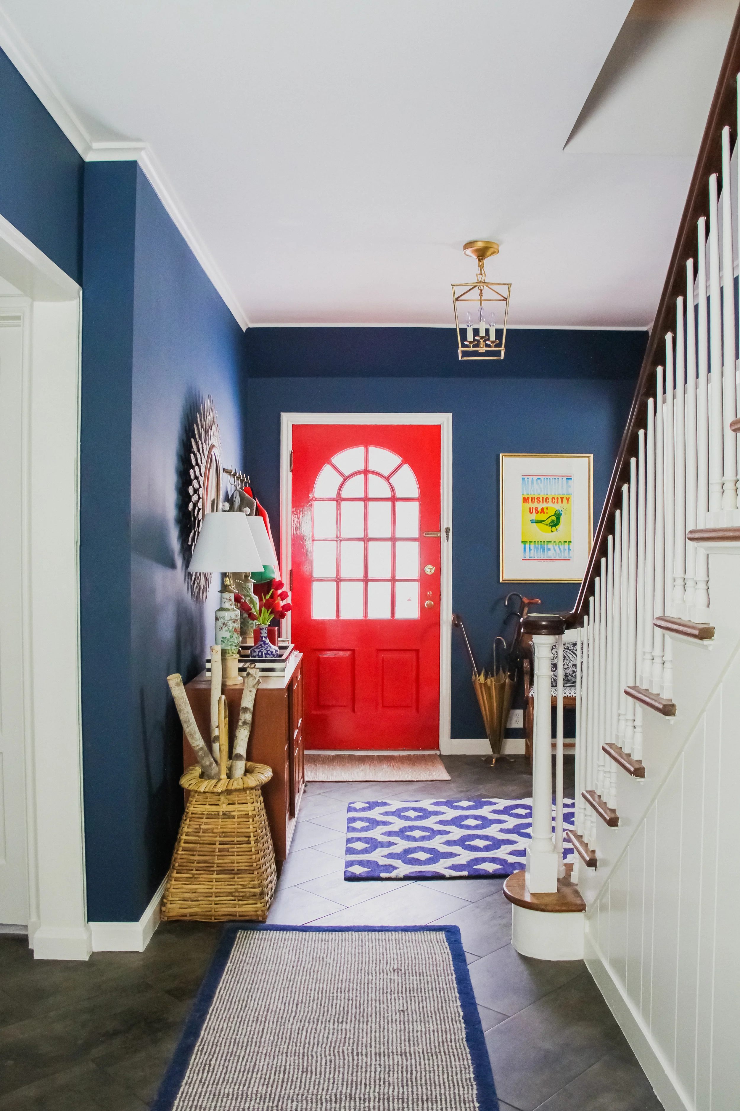
Bright, preppy, and maybe even a tad cheeky, this bold blue entryway packs a punch while still remaining classic and restrained.
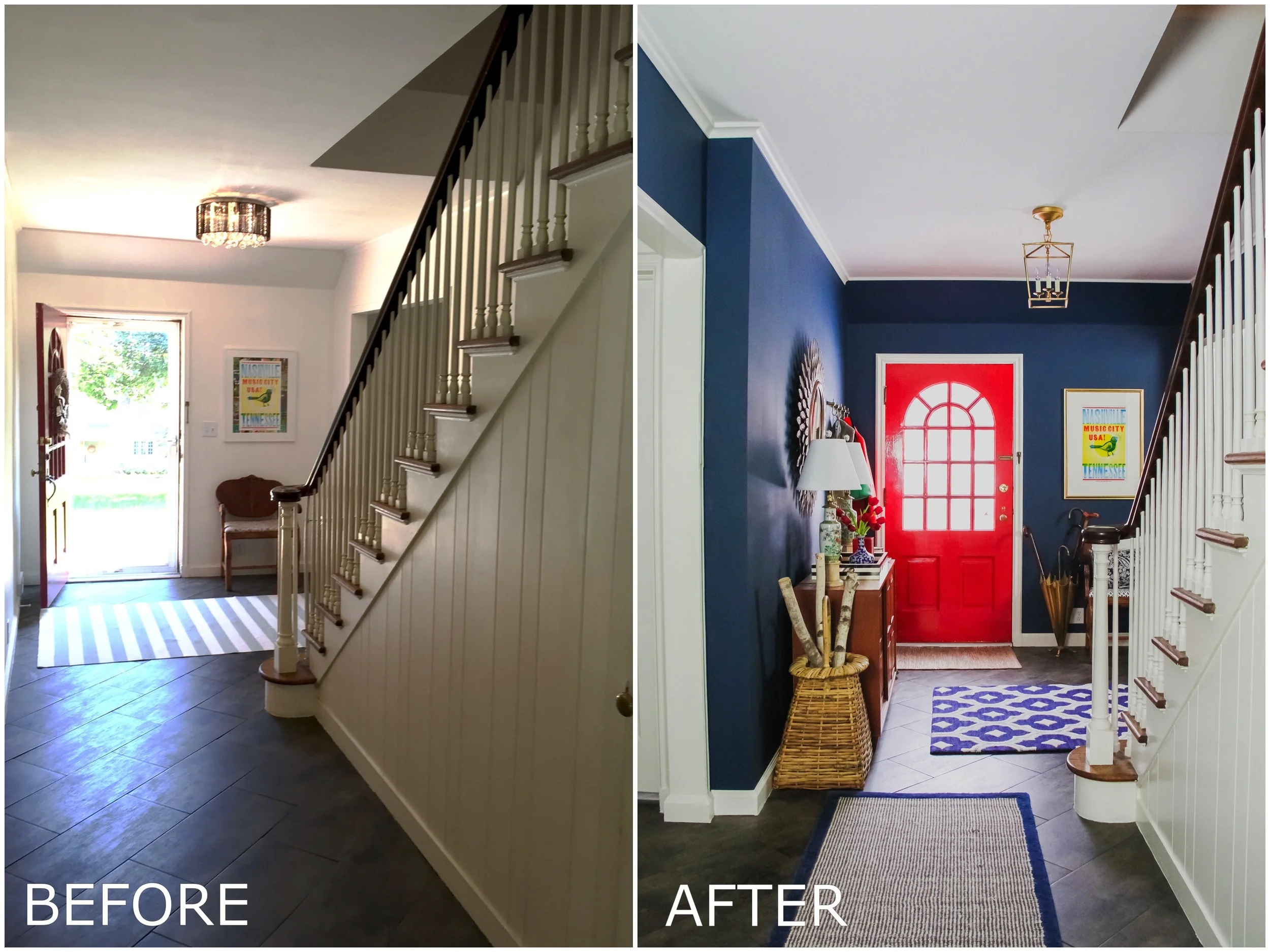
Homeowners Traci and Judd lean toward classic stylings with a twist. They wanted the entryway in their 1939 Cape Cod Colonial to make an impact, and set the tone for the rest of their refined but comfortable home.
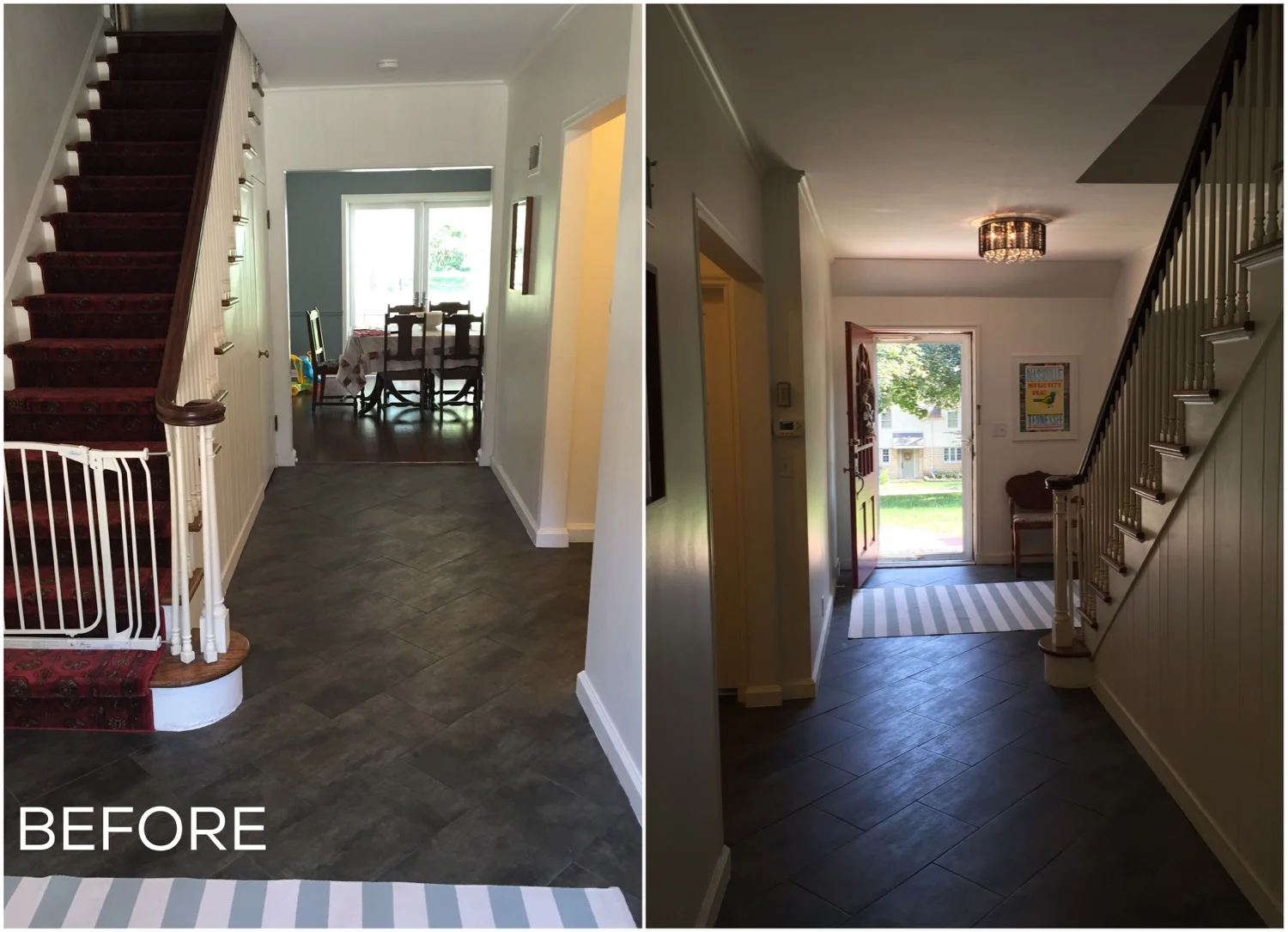
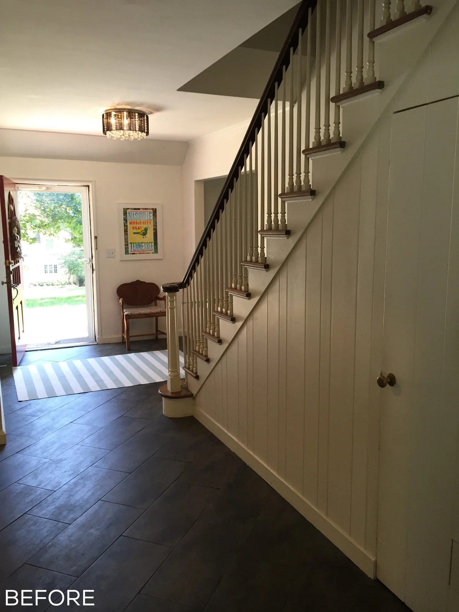
Here's how it started out:
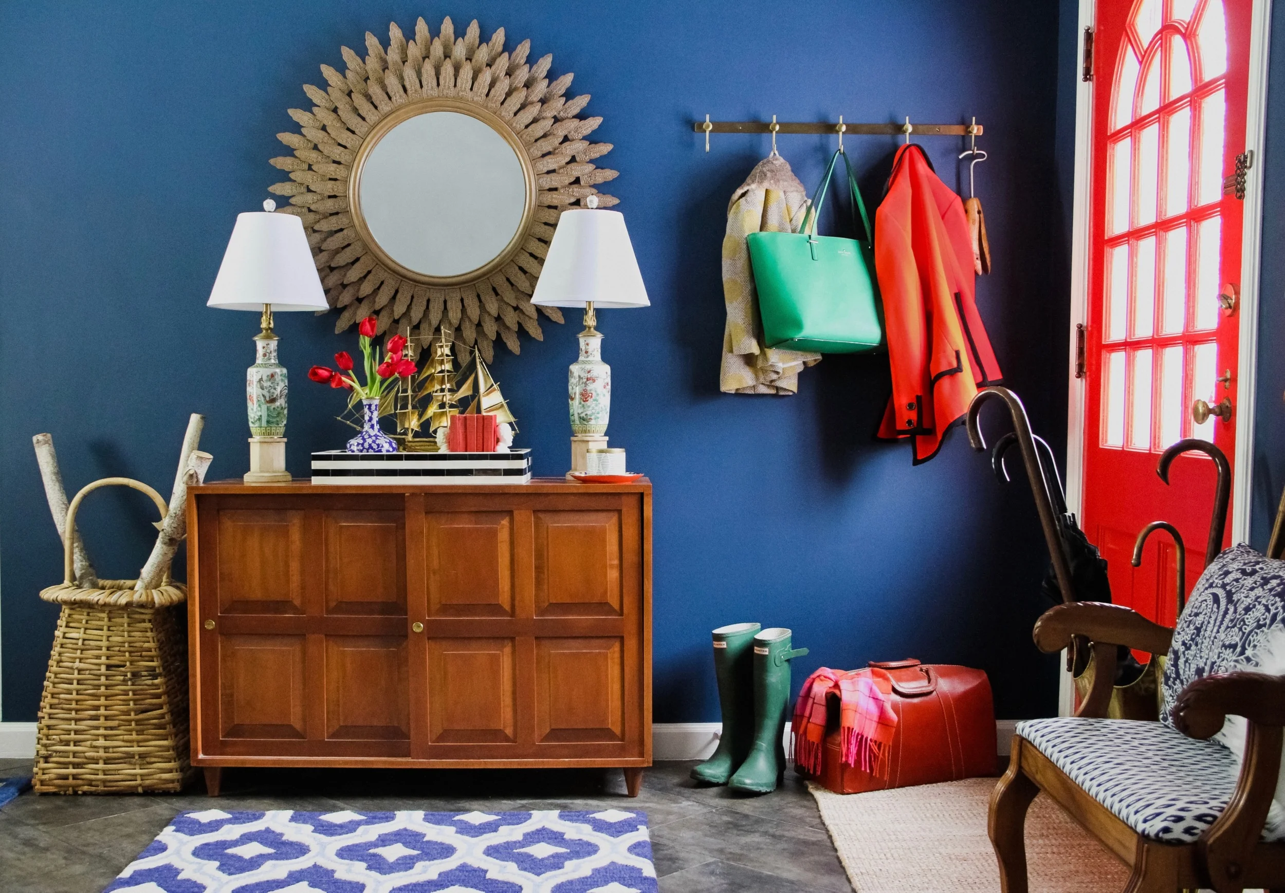
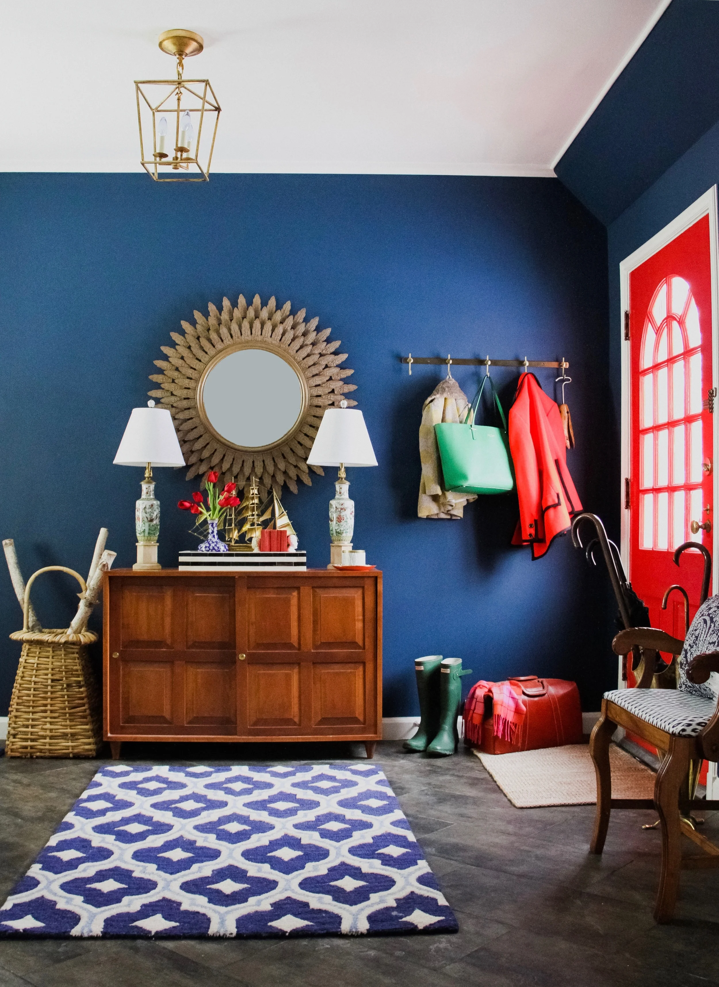
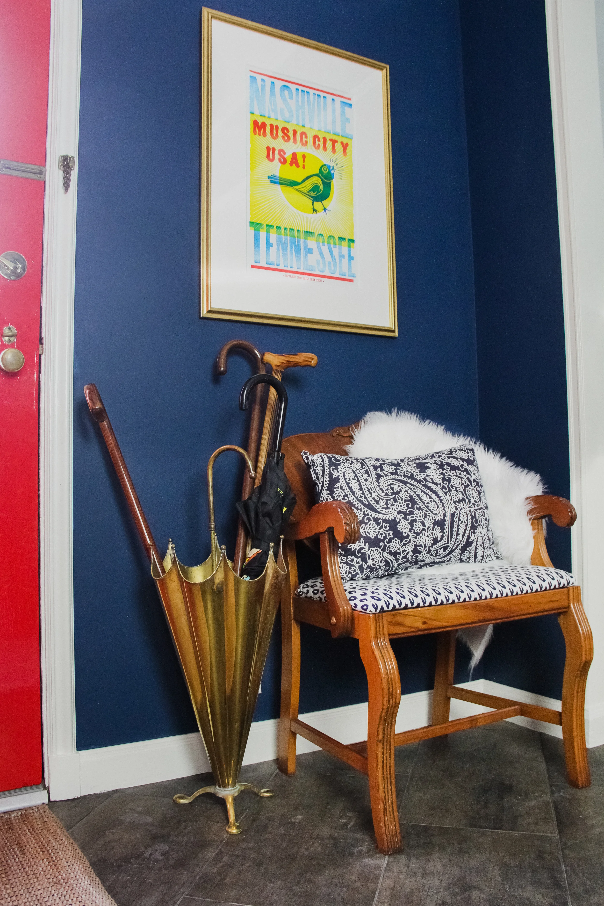
Painting the walls Benjamin Moore's Washington Blue immediately created a dramatic impact. From there I layered in additional bold primary colors to evoke an iconic historic vibe – red, yellow, and green. It could've gone childish, but paired with substantial and ornate pieces like the antique bench, paneled console, and textured sunburst mirror, the palette remains mature without taking itself too seriously. And the brass accents keep it feeling fresh and not at all stuffy.
Pendant Light | Mirror (similar) | Coat Rack (similar)
Originally I'd intended on using an antique dresser, but wasn't able to find one to fit the somewhat narrow space between the stairs and wall. Before I could wander too far into "How Much Room Do They Really Need" territory, I stumbled upon the smaller-profiled console at an antique store and instantly fell in love with its warm honey tone and paneled sliding doors.
The lamps were a dream find. From the outset I had my heart set on a matching pair of chinoiserie style table lamps, but sourcing them affordably proved problematic. Just before I started to pivot I popped into one last local antique shop where I found these! They were missing shades, but that was an easy hurdle to overcome.
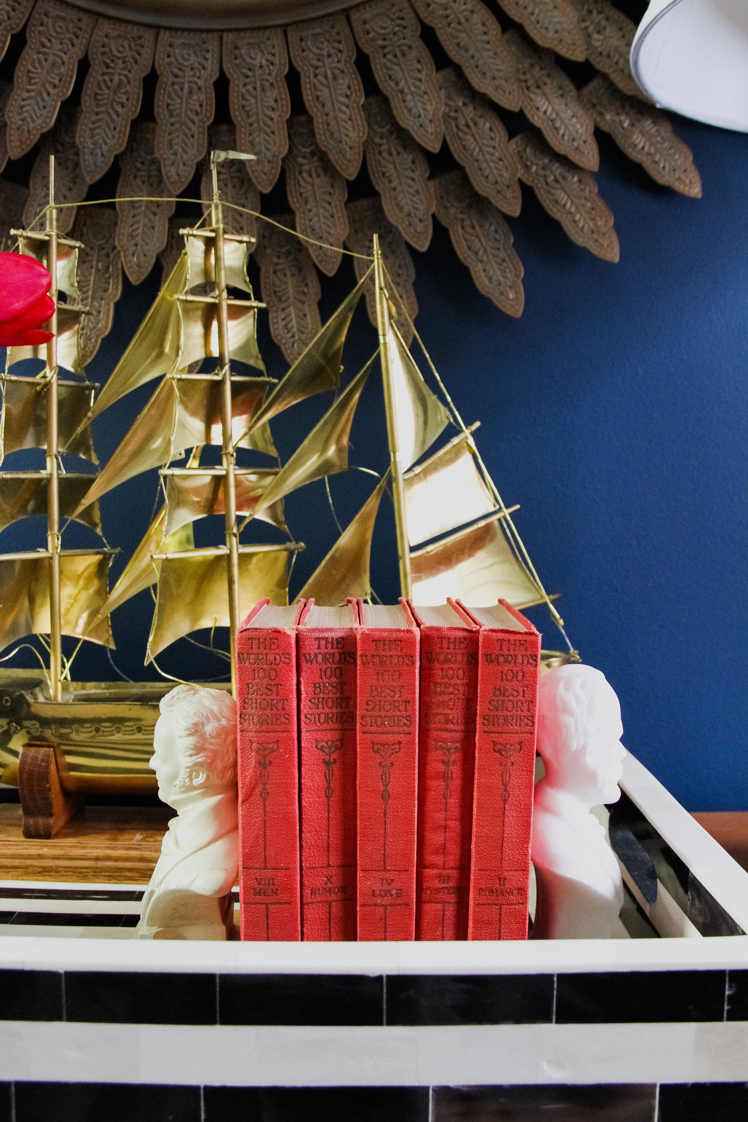
The remaining details on the console are some of my favorite. The blue floral vase was an on-hand treasure Traci let me snag from another spot in her house. She also found the black and white striped tray from One Kings Lane, planning to use it somewhere else if I didn't like it, but it's perfect! My favorite thrift find, though, is that vintage to-scale brass ship model looming in the background. I'm told their girls have already found it very useful when playing Pirate Princess.
The Nashville print got beefed up with a bigger mat and more substantial gold frame. And I searched long and hard for that vintage brass umbrella stand, finally sourcing it via ebay. It adds just the right amount of quirkiness.
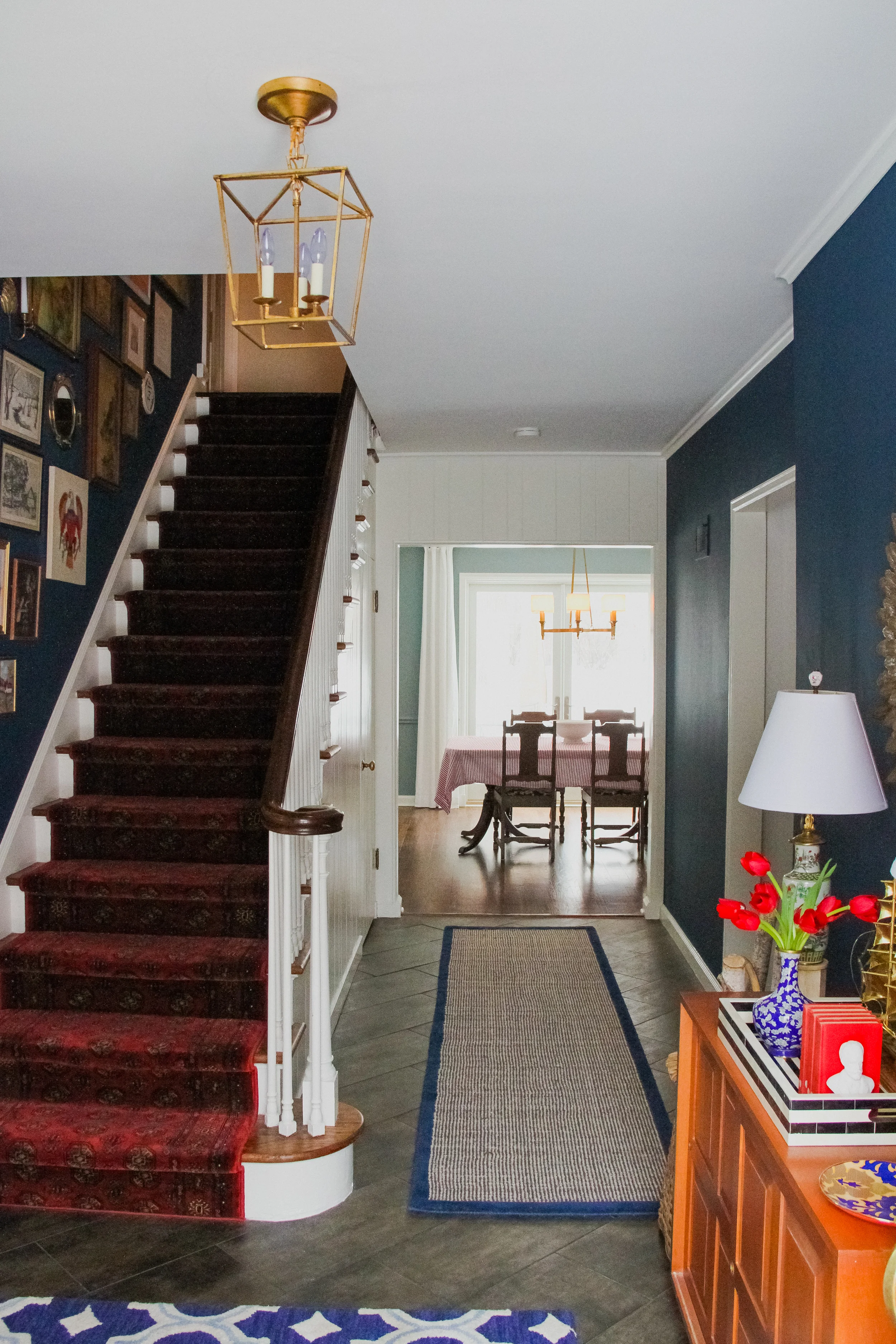
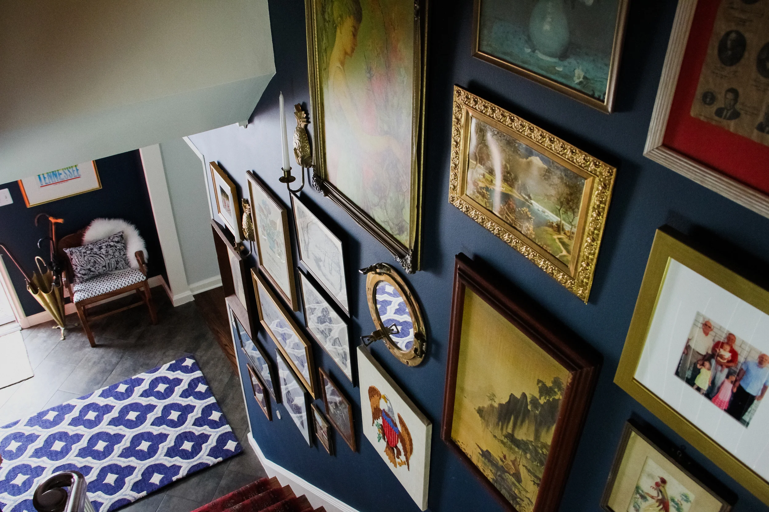
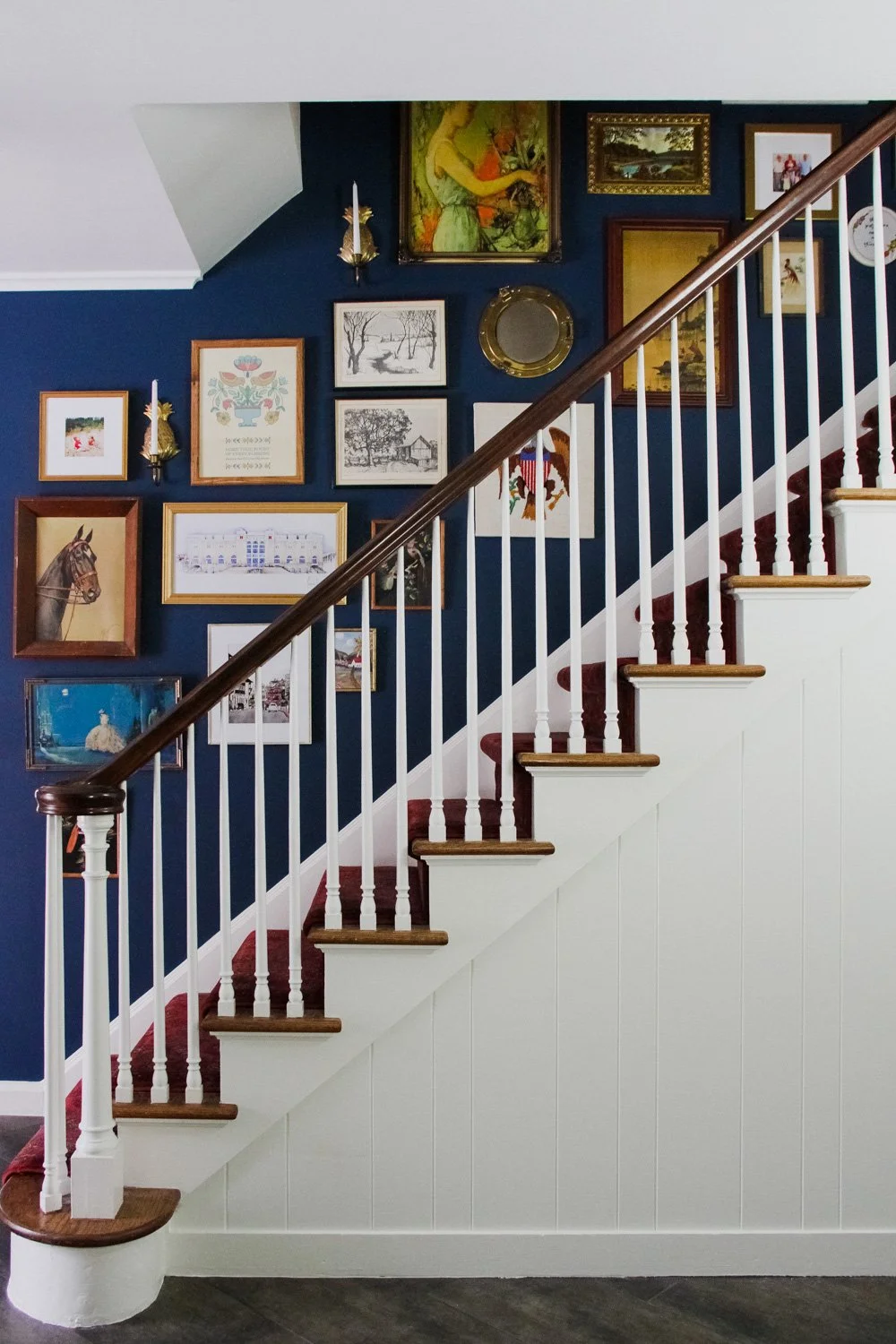
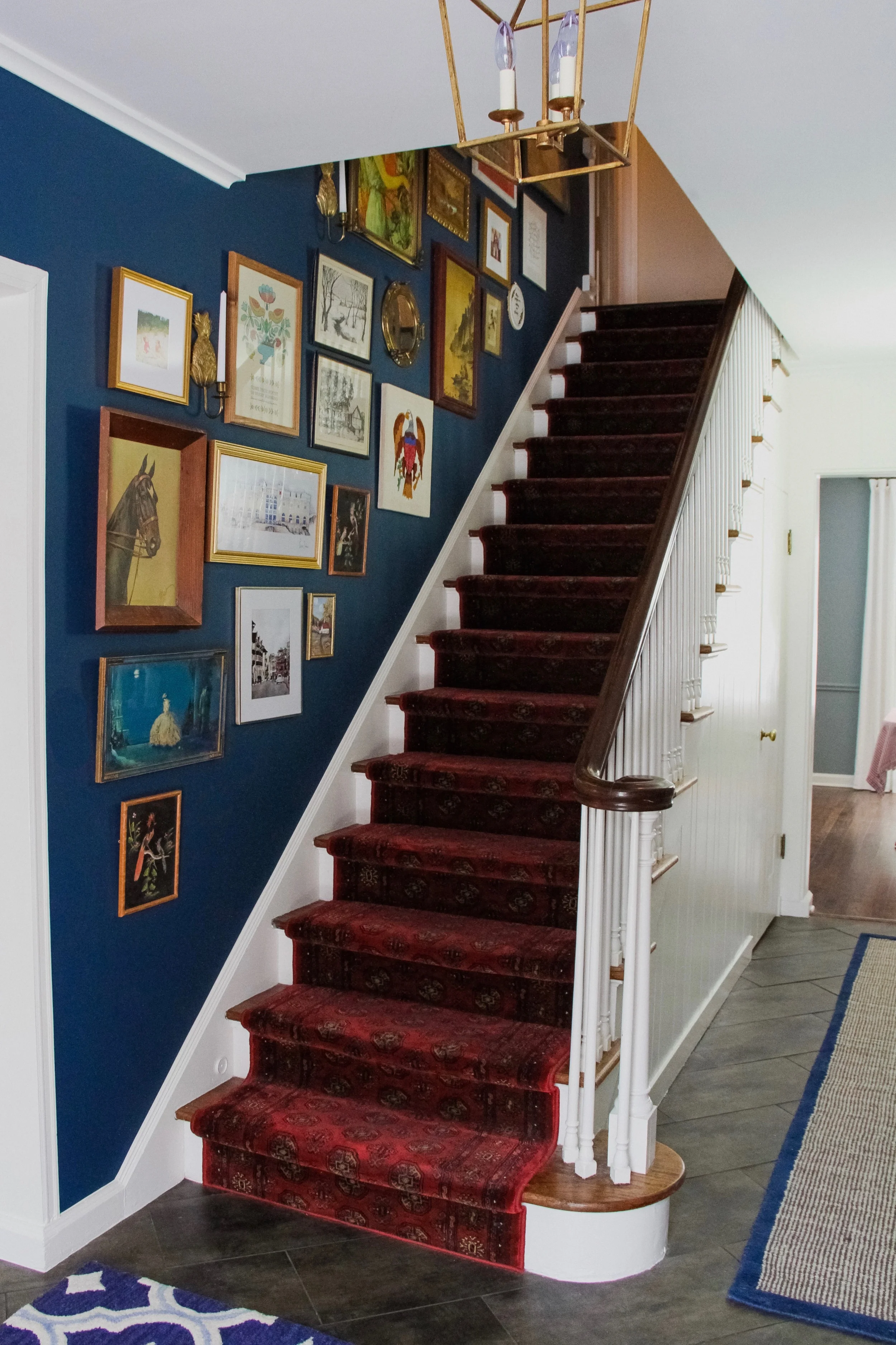
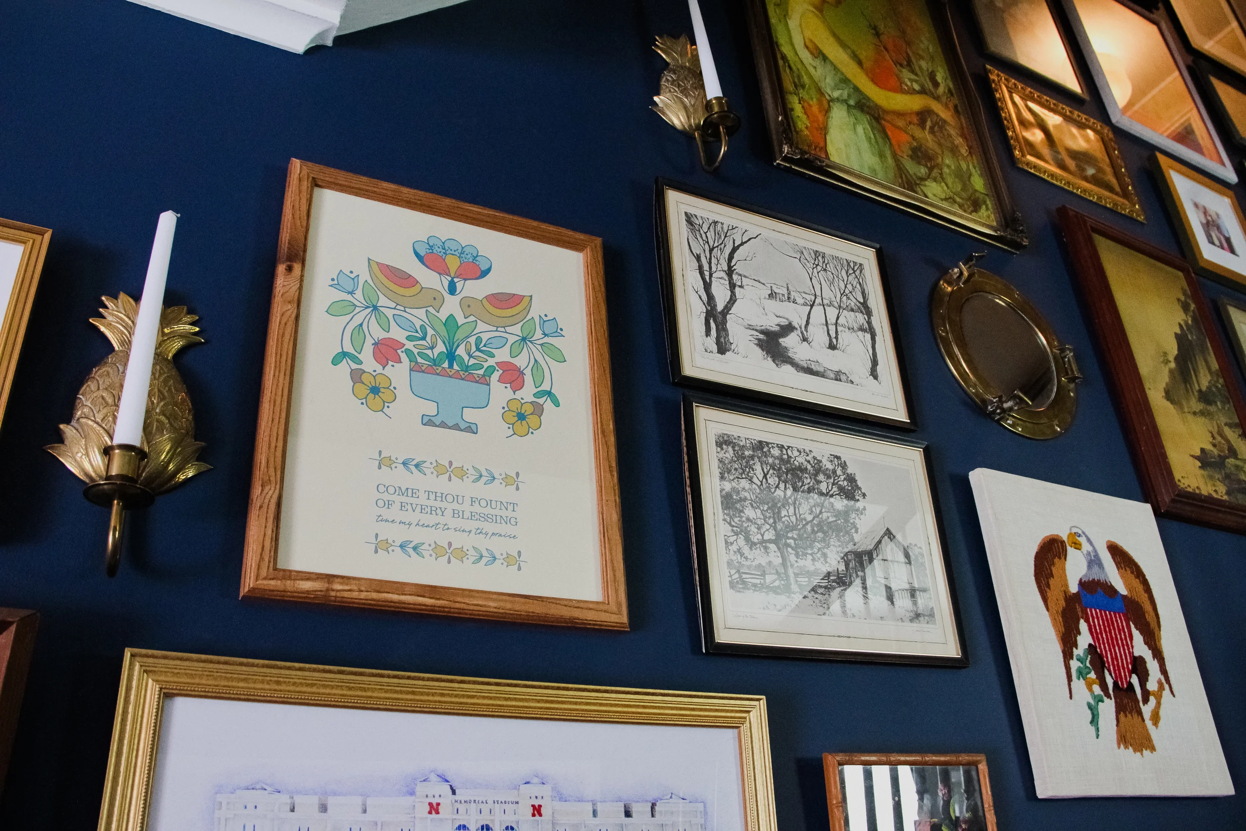
But, the real showstopper is the gallery wall up the stairwell. Comprised of over thirty varying pieces of framed art, family photos, patriotic embroidery, brass pineapple sconces, and a functioning porthole mirror, it's definitely where I got a little weird.
Shopping is probably my favorite part of designing for clients – a bit strange, because in general I hate the aimless, time-wasting, retail-therapy notion of it. However, when it's intentional and furthering a specific vision, then it's totally my jam. So when Traci mentioned a gallery wall, I was excited to begin sourcing. But before I began wandering the hallowed aisles of local thrift haunts and antique shops, I asked her what she already had on hand. Luckily it was a lot, and it was good, the patriotic eagle being my main inspiration and starting off point. Then I searched for all the things that reminded me of English royalty, pastoral hunting adventures, scenic tranquility, New World patriotism and dashes of whimsical kitsch. After a few back and forth emails with pics of our growing collections, we pooled them together to create this masterwork:
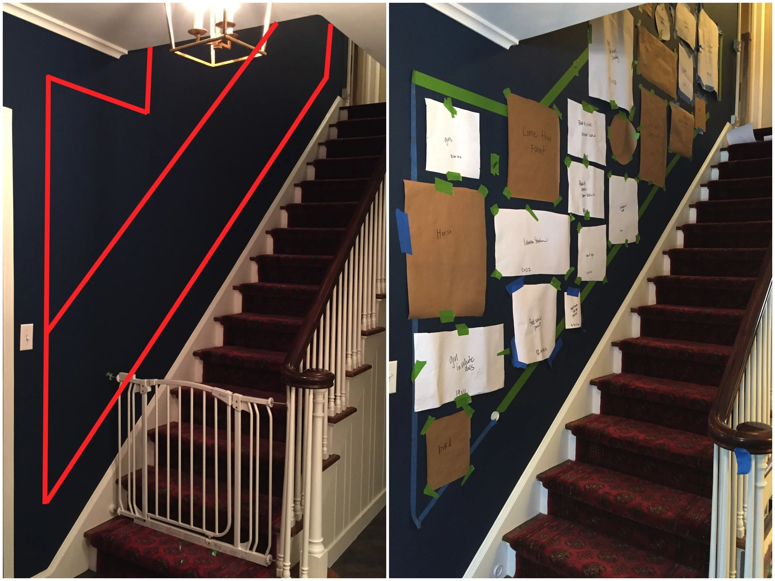
There are several ways to install a gallery wall, and in the past I've always employed the "lay it on the floor in roughly the right layout, then hammer and hope" method. Since this was an angled layout (and I'm a professional, of course) I figured I should be a little more systematic. I contemplated making a rendering, but sometimes you just have to see how everything works together and create space for in-the-moment fluidity to make sure it's right. So I implemented the "classic" option – paper and tape (also hiring a handyman to install it all, thanks Josh).
I love that every piece has a story. Found on a road trip Luke and I took over the summer, the horse portrait above was one of the first items I knew would be perfect for the wall. After exiting the interstate in the name of Dunkin Donuts, we ended up across the road from a huge indoor flea occupying what appeared to be an infinite and former Wal-Mart, or something akin. Without a ton of room in our rental car I couldn't buy everything I wanted, but there was something so compelling about Mr. Mid-Century Horse and his pensive gaze.
And at the the top right, you can't tell from these photos, but tucked just far enough out of the way there's a small embroidery hoop with the lovely script, "These pretzels are making me thirsty." It brings a smile to Traci's face every time she runs up and down the stairs to administer mid-afternoon naps and collect the laundry.
I'm super pleased with how Traci and Judd’s entryway turned out. It's a playful take on traditional, and completely Town & Country Mod.
* Thank you Bethany Gilbert for the incredible photos
