Basement Blues (No More!)
Allen and Bethany’s basement redesign is complete! And really my favorite part about the whole experience is that it basically prompted a crash course in fast friendship. All that time emailing back and forth, being transparent with ideas, giving and receiving feedback and developing trust – as an introvert who takes a solid year to get to know anyone this was definitely a bonus. Wait, did I just describe transactional as my preferred method of friendship…
Let's take a look at some before photos to see where we started.
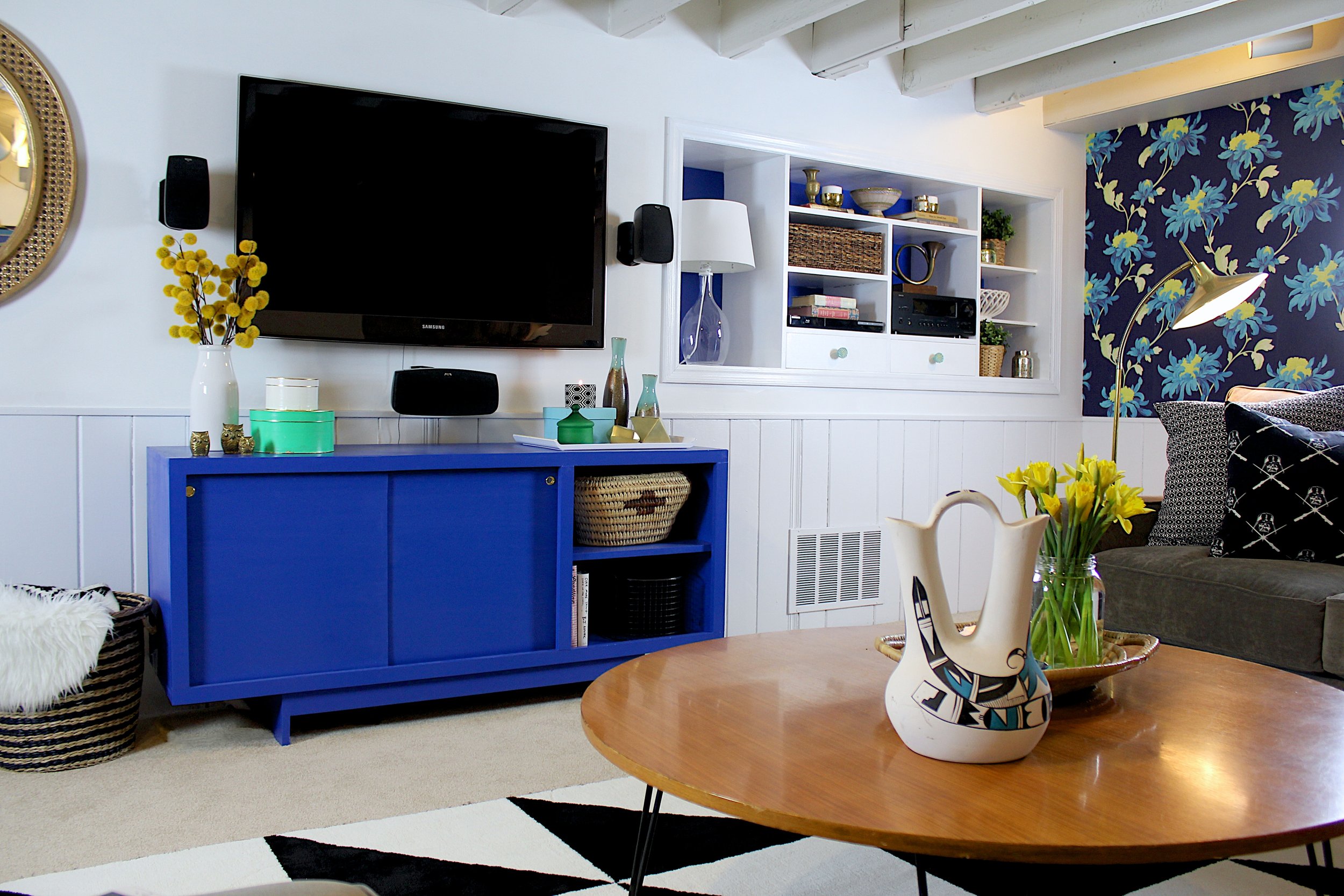
The first order of business was painting all the remaining oak woodwork white. Bethany got that job while I learned how to build furniture. Painting trim isn't glamorous, but the result is always satisfying and much more updated. The newly painted white built-ins got a stealthy splash of cobalt as well.
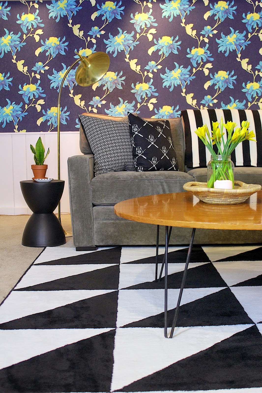
Then came the wallpaper. Armed with some googled instructions and a bottle of wine we got to work. The intent was to add a focal point without overpowering the below-grade room. We opted for an accent wall as you first enter the room and what an impact!
The rug is from Ikea and super affordable. I love how bold and punchy it is, but how well it still works with all of the different patterns and colors in the room. And that hairpin legged coffee table from my friend, and midcentury furniture reseller, Tiffani is perfection.
Art is probably the toughest aspect of designing a space quickly. It's just really rare to find affordable, non-generic, interesting pieces that work with a room's design. I was super excited when Bethany showed me one of her photos she'd had enlarged and printed on industrial paper. She'd never framed it and wasn't even sure if she was going to use it anywhere. It was the perfect nature-influenced element to throw in the mix with all the other super saturated color and contrasting black and white. To frame it I stapled it to some 1x2s, attached some black chain, and screwed it to the wall so the print wouldn't buckle.
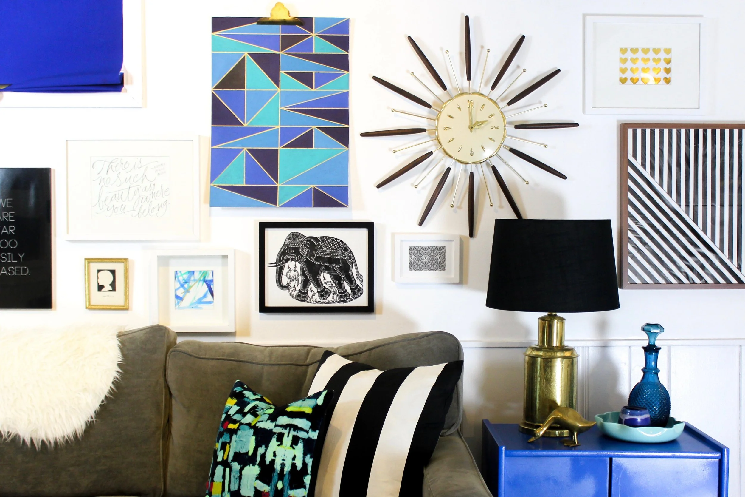
On the other side of the window we installed a gallery wall. I wanted the small basement window to feel like it was part of the overall presentation so we used varying prints, thrifted objects, and some DIY prowess to create a less structured and more organic grouping. We also had the pleasure of featuring our friend, and talented hand lettering artist Cheryl Dyer's commissioned work "There is no such beauty as where you belong." It's a line from The Road Home by Stephen Paulus, one of Bethany's favorite choral pieces.
And of course there's the cobalt console that I previously took two posts to write way too much about. But she is so pretty.
Overall, I'm thrilled! And I can't wait for whatever the next project is!


