Small Changes Transform This Former Sunroom Turned Primary Bath
This post contains affiliate links. I may make a small commission off purchases made through the links I’ve provided. Thanks for supporting my small business!
Ready for Part II?
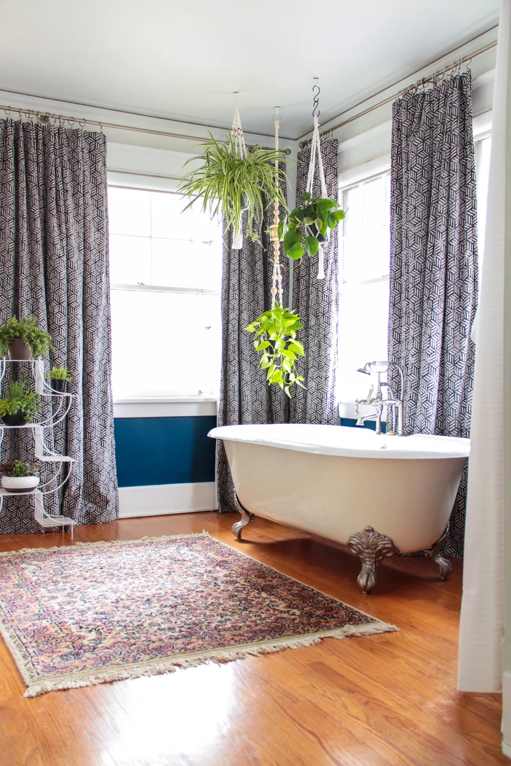
I love how my client's primary bedroom turned out, but their en suite bath really has my heart. The luxury of such a spacious bathroom isn't something most of us may ever enjoy, but when I walked into their room and caught my first glimpse of that free-standing claw foot tub, surrounded by walls of windows and all that glorious natural light, I knew it could be something special!
While the basic layout of the space was great, it was definitely in need of some updating. Here’s what it looked like to begin with:
To start, I had the lower portion of the walls painted Sherwin Williams Loyal Blue. This added a jolt of personality in a room overflowing with natural light that could handle bold.
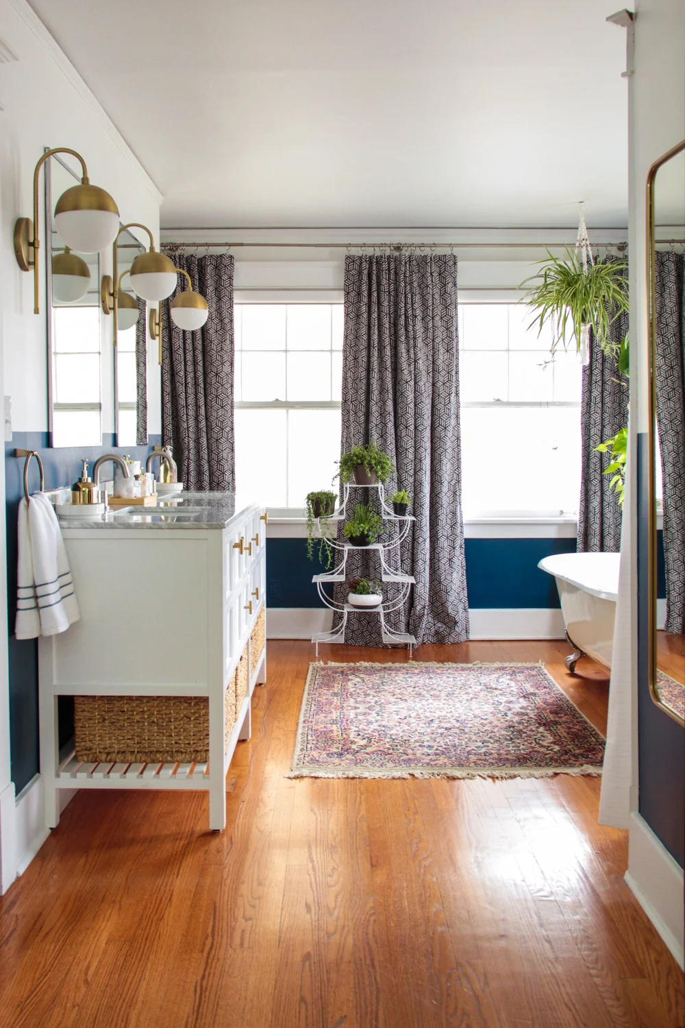
But this makeover wasn't just about making the space prettier. The primary goal was to increase the room's functionality – addressing issues of limited storage and a laughable amount of countertop surface area. (Seriously, for a room this size, a small single-sink vanity on such an expansive wall was puzzling.) Finding a budget-friendly double vanity was at the top of the list.
If you've shopped for a bathroom vanity then you know this can be a hefty expense and the lower-priced options aren't always good-looking. But this is pretty much the case with almost everything, right? My go-to when searching for affordable ready-made fixtures is something simple and a bit basic, with clean lines and almost no "design" details. In the end, you can always use less expensive decorative items to add a layer of interest without paying for someone else's questionable design choices. For this specific project that meant searching for something white, with shaker style cabinet doors, and a classic marble countertop. I'm really happy with the one we chose from Wayfair!
The other main design objective in the bathroom was to harmoniously incorporate mixed metals. I love the look of brass fixtures and hardware, but scroll back up and you'll see the faucet and clawfeet on the tub are a brushed nickel finish. Rather than just commit to keeping all the finishes nickel for uniformities' sake I decided to intentionally let brass, nickel, and even some stainless steel, commingle. In fact, I prefer the look of mixed metals because it keeps a space from feeling too matchy-matchy. The key is to create a balance.
To do so I chose a brushed nickel sink faucet, stainless steel framed mirrors, switched out the cabinet knobs (side note: it is KILLING me that I didn't catch the crooked knobs before we shot these photos...), then incorporated beautiful brass globe sconces to punctuate the look.
To highlight the incredible banks of windows I incorporated these navy and white curtain panels from West Elm (sadly, no longer available). Their worn-in textured pattern adds bohemian charm and, though It's a little hard to tell in photos, the fabric is actually a super luxurious velvet – perfect for this Bohemian Meets Luxe bath!
I kept the styling to a minimum – bathrooms are primarily practical after all – but couldn't miss the chance to add in some hanging plants for that just bathed in the jungle feel.
Is there anything more tranquil and spa-like?
I'm so happy with how this project came together! It feels cohesive with their primary bedroom, but has enough unique elements to ensure the design stands on its own. A blend of relaxing whimsy and luxurious glamour, it's the perfect personal oasis at a long day's end.
Photography: Bethany Gilbert


