A Mid Mod Home Exploding with Color and Pattern
This post contains affiliate links. I may make a small commission off purchases made through the links I’ve provided. Thanks for supporting my small business!
Like every great project, this is the product of an incredible collaboration.
When Darby and Andrew Whealy left their charming Foursquare for the Midcentury Rambler of their dreams, they immediately enlisted their friends, Architects Brian and Andrea Kelly, of Atom Design Studio, to transform their self-described “Brady Bunch” house. The result of this partnership, coupled with the design skills of builder/contractor Doug Kiser, is this stunning Midcentury with-an-emphasis-on Modern work of art.
Speaking of art…
Andrew, an attorney by trade, revealed his, up till then quiet, art connoisseurship. Their new, expertly curated, collection is now splashed amid the soaring white walls and contemporary wood and steel motifs.
Then there’s Darby whose personality matches her penchant for free-spirited color. She nimbly wields an impassioned green thumb, boasts a stylist’s eye, and the covetable collection of tchotchkes to match.
And that’s where I came in — a bridge spanning the modern-meets-approachable. I was charged with furnishing their space so that Darby’s bohemian leanings, Andrew’s modern art passion, and the house’s contemporary finishes all cohabitated effortlessly. After all, in addition to Darby and Andrew, this is home to two early-adolescents and two four-legged friends, so the house still needed to function as an inviting and comfortably livable home, not a showpiece.
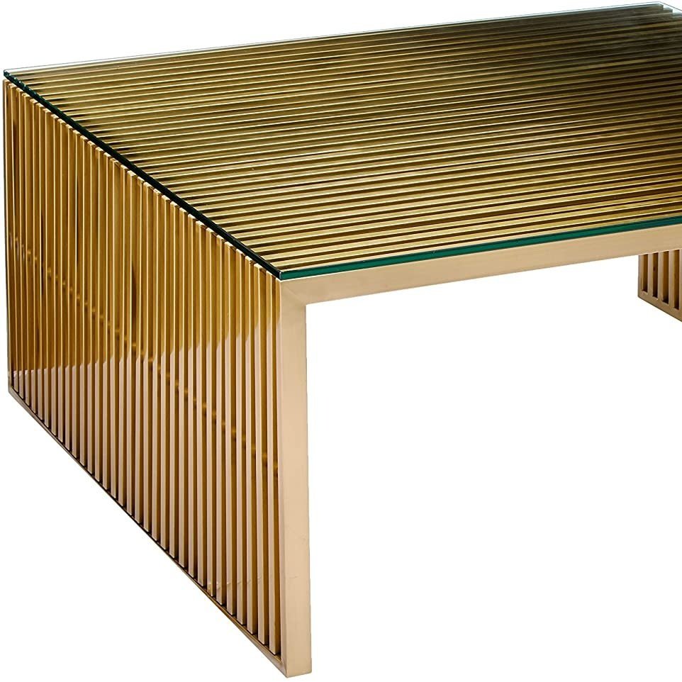
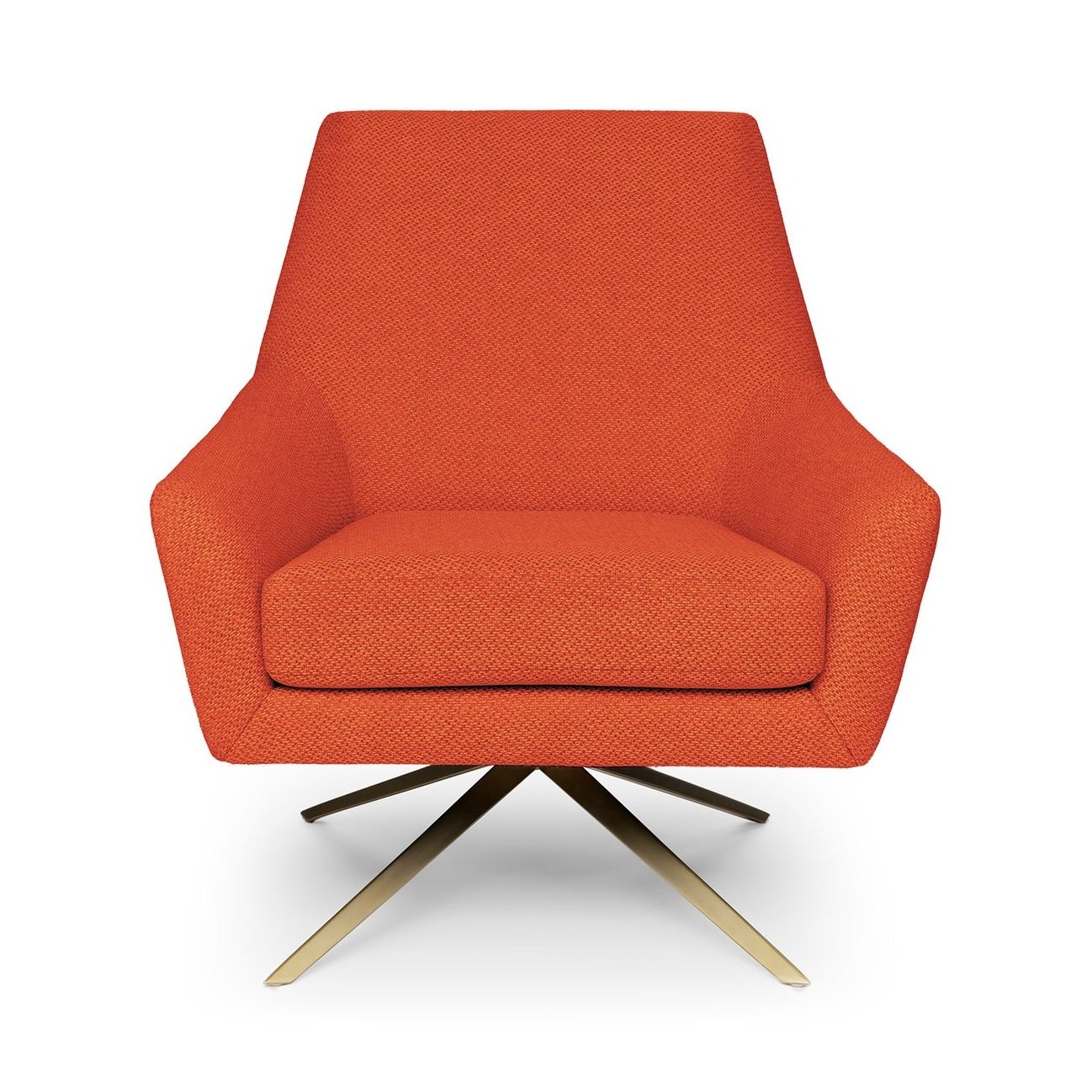
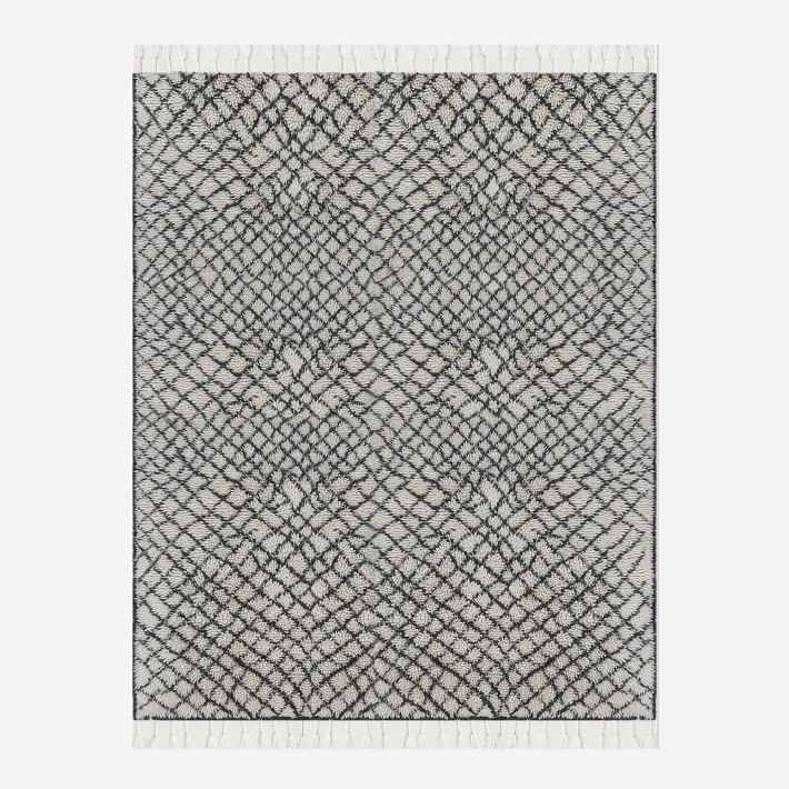
The main level, while open concept, is intentionally separated into three distinct living spaces. Beyond the prototypic double doors emerges the primary entertaining zone, the living room. To anchor it, I chose the Concentric Circle rug from West Elm, (sadly, no longer available) for its C-O-Z-Y high pile. Two chairs, in saturated orange, flank the fireplace, able to swivel at a moments notice, to and fro the glow of the fire and allure of a good conversation. A Steinway upright sits at the ready for midweek piano practice or impromptu sing-a-longs. And an oversized brass and glass coffee table provides plenty of party-drink surface area, harmoniously melding with the other metal and steel elements throughout.
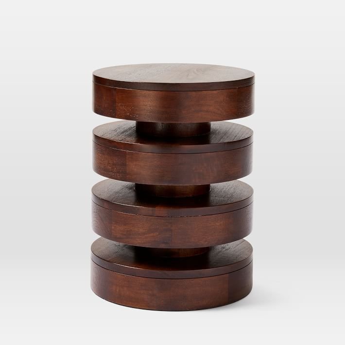
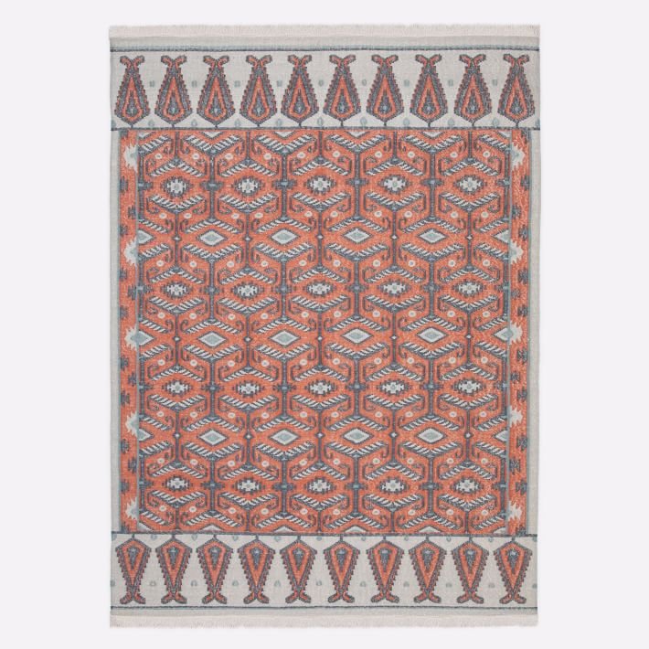
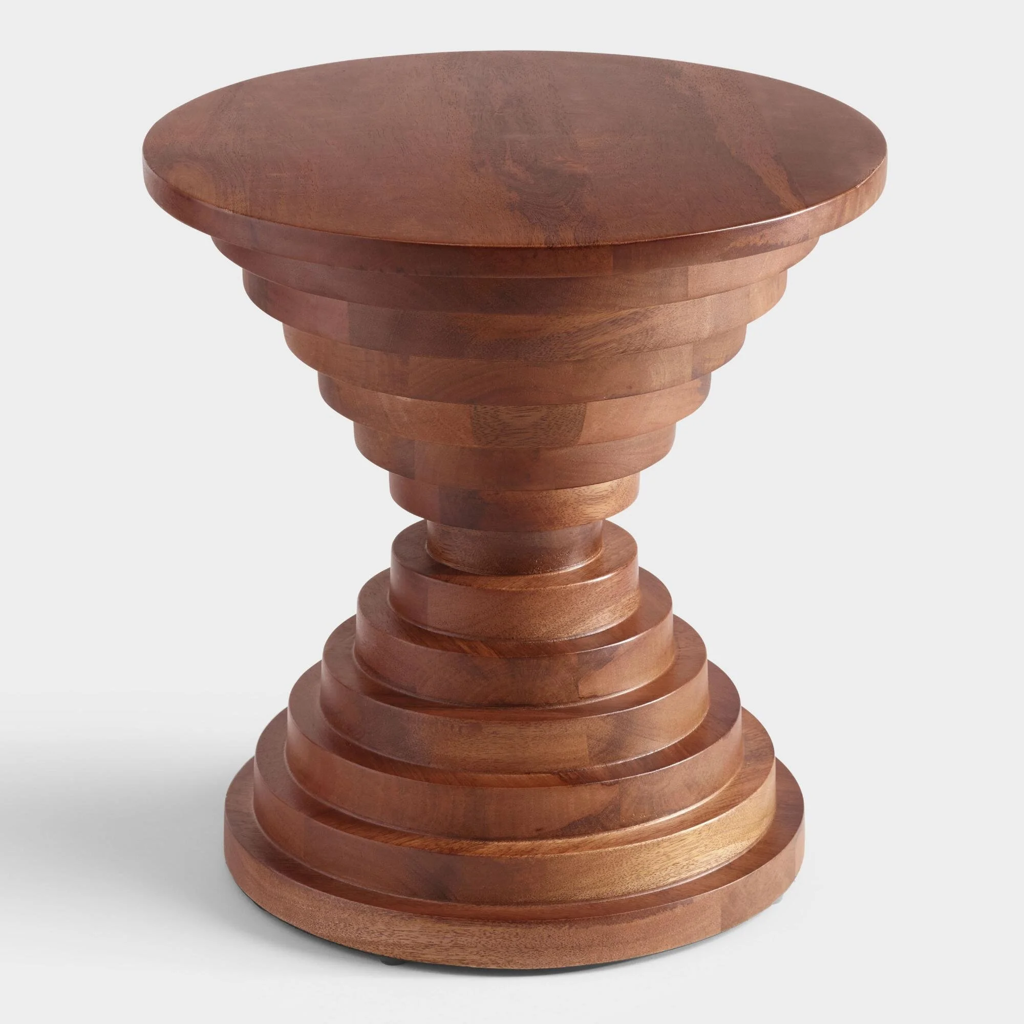
In front of the soaring windows, sharp angles are softened by layers of green; tucked within their canopy, an intimate seating area for two. Darby and Andrew already owned the two vintage Herman Miller swivel chairs, so I sourced a playful rug and drum table to define the nook and engage the other bohemian elements in the main seating area.
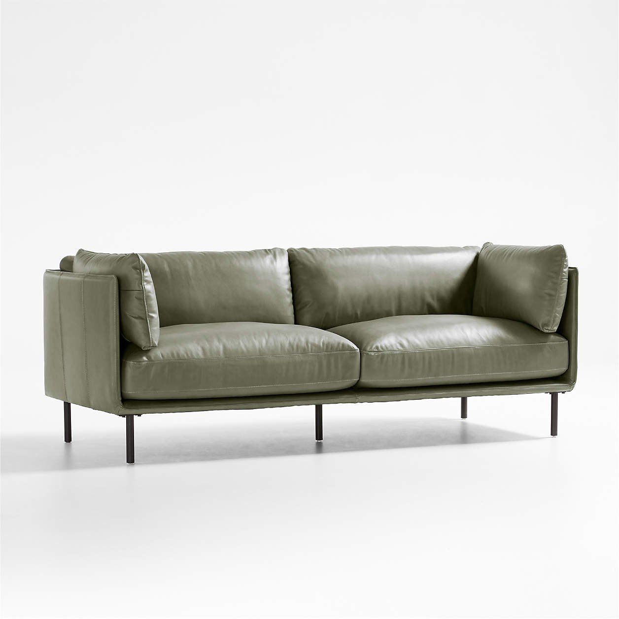
The olive green leather sofa is such a treasure. Chosen for its color, fabrication, and streamlined silhouette, it’s the perfect not neutral, neutral. It’s also simultaneously comfortable, in a highly practical fabric for entertaining, plus boasts those perfectly alluring brass legs. And, like so many other pieces from this project, is, crushingly, no longer available. This one is a good alternative, though.
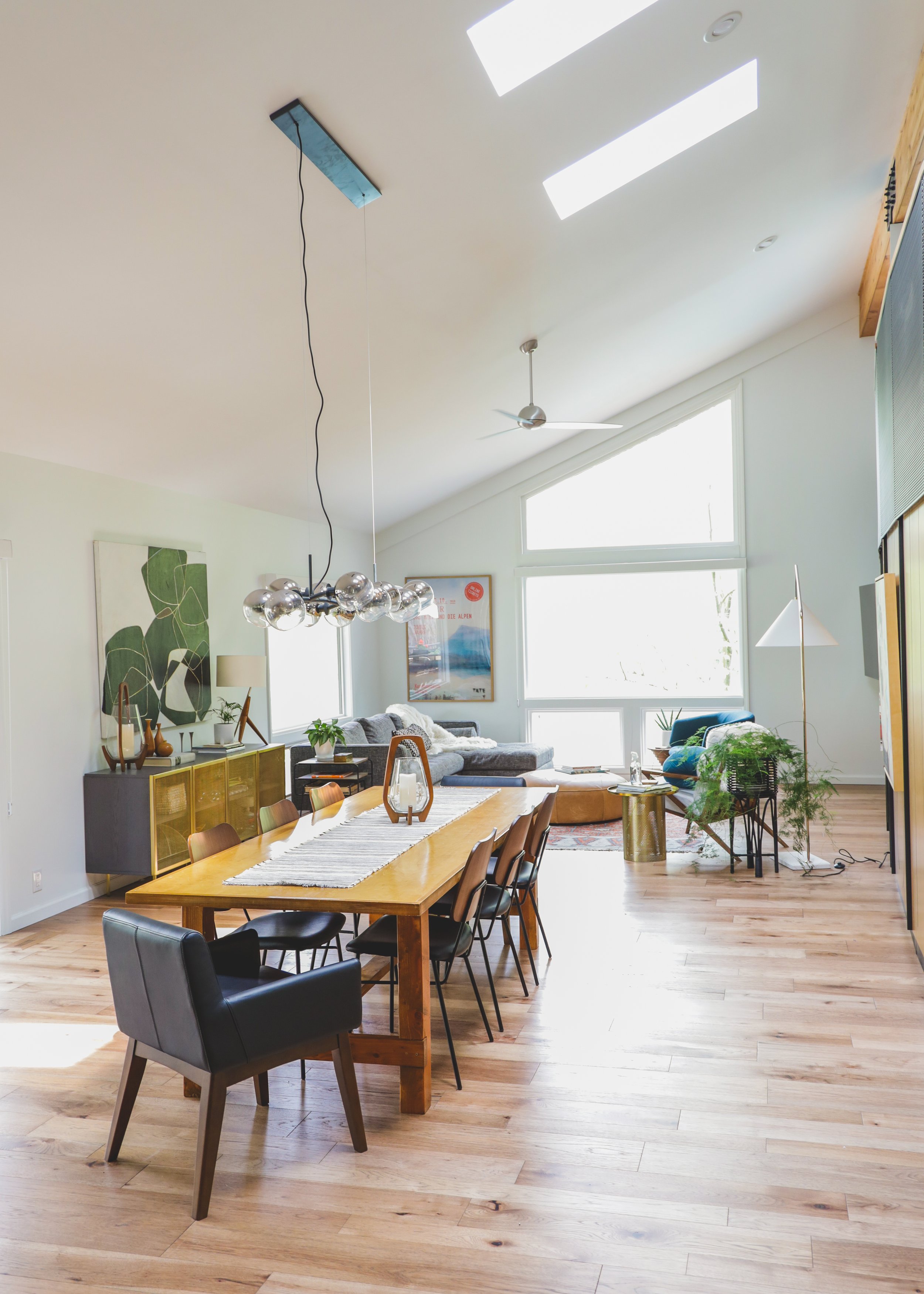
Just beyond the double sided fireplace lives the dining area.
If you’ve been reading this blog for awhile, you might recognize that table. I built it for Darby and Andrew’s former home, lovingly dubbed The Grown-Up Bohemian. I’ve never harbored furniture-builder aspirations, but out of an earnest desire to remain within budget, and inability to find the table I wanted, I decided to go ahead and make one. It’s not without its, um, charms, but the fact that Darby wanted to keep it and reuse it in their beautiful new home was such an honor.
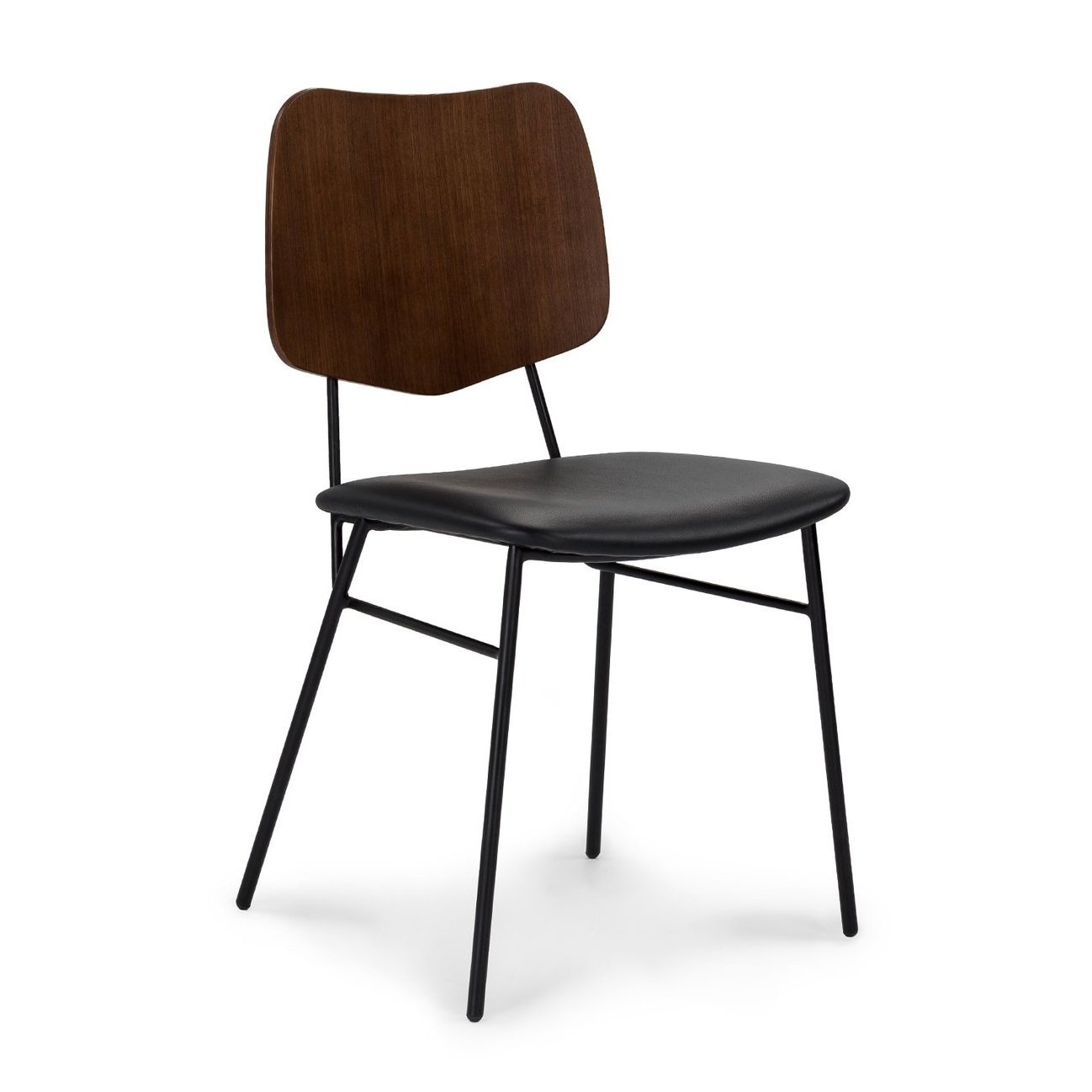
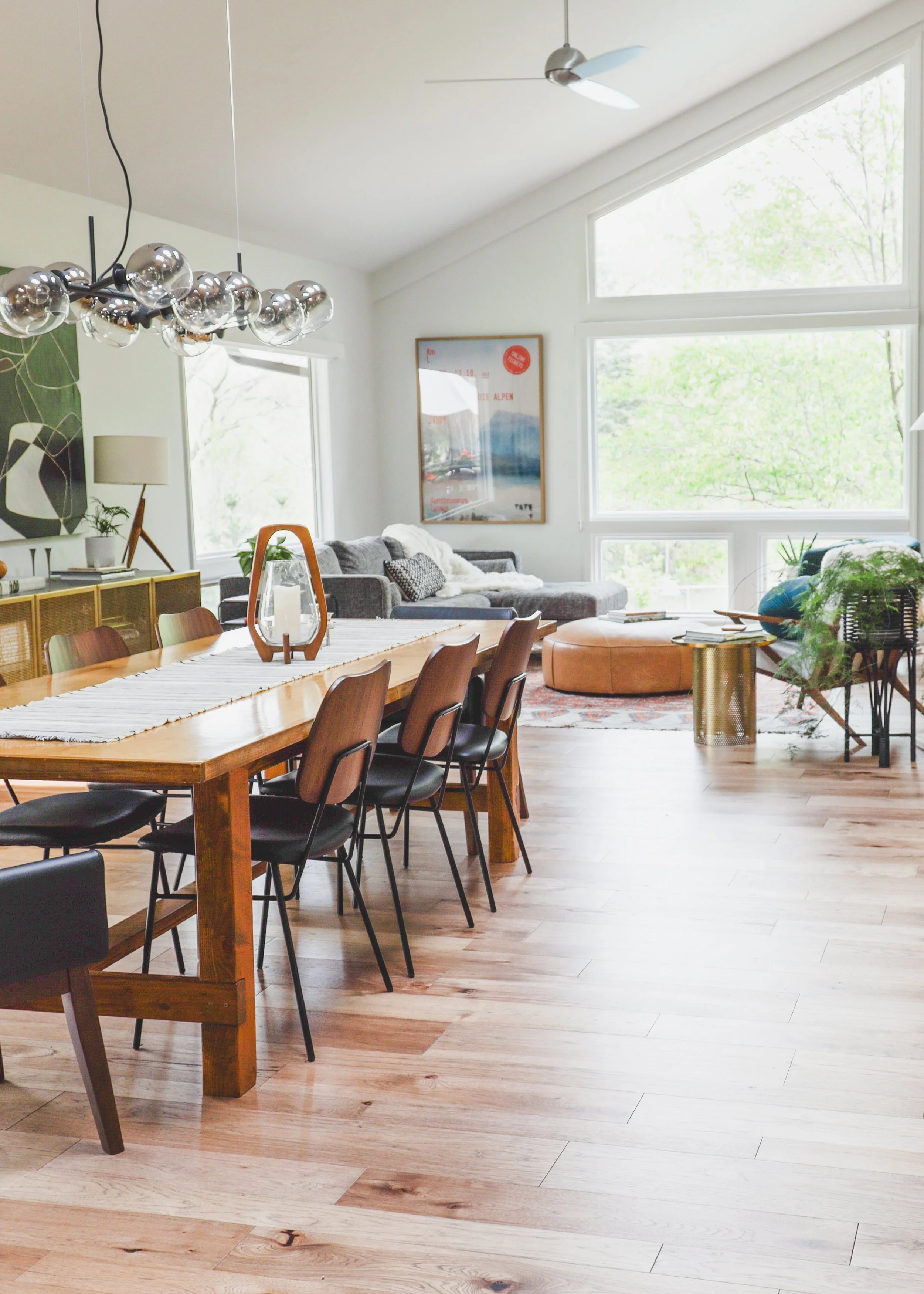
To modernize it for its new surroundings, I paired it with the industrial black and walnut Versus chair. Deceptively comfortable, these leather-seated chairs mean this table is now perfect for long-meandering conversation over multiple dishes. The ends, capped with a low back leather armchair, complete the look.
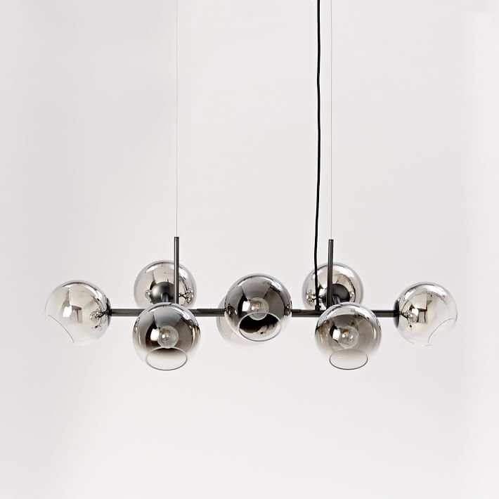
In the kitchen, open-weave basket stools atop a classic, midcentury base provide the perfect casual dining perch. A globe pendant, original to the home and repurposed from another room, hangs above the kitchen island. And the Sculptural Staggered Light Chandelier atop the dining table bridges the old with the new seamlessly.
A moment of transparency… Every time I look at that wooden sculpture below I feel a pang of longing. I sourced it years ago at an estate sale for Darby and Andrew’s former home. And there’s always been a part of me that – despite knowing that a rambunctious preschooler and adorably clumsy toddler would reduce it to a dried pile of kindling – wishes she were mine. But nestled ‘neath the forest of Darby’s green houseplants, I can see she is absolutely where she belongs.
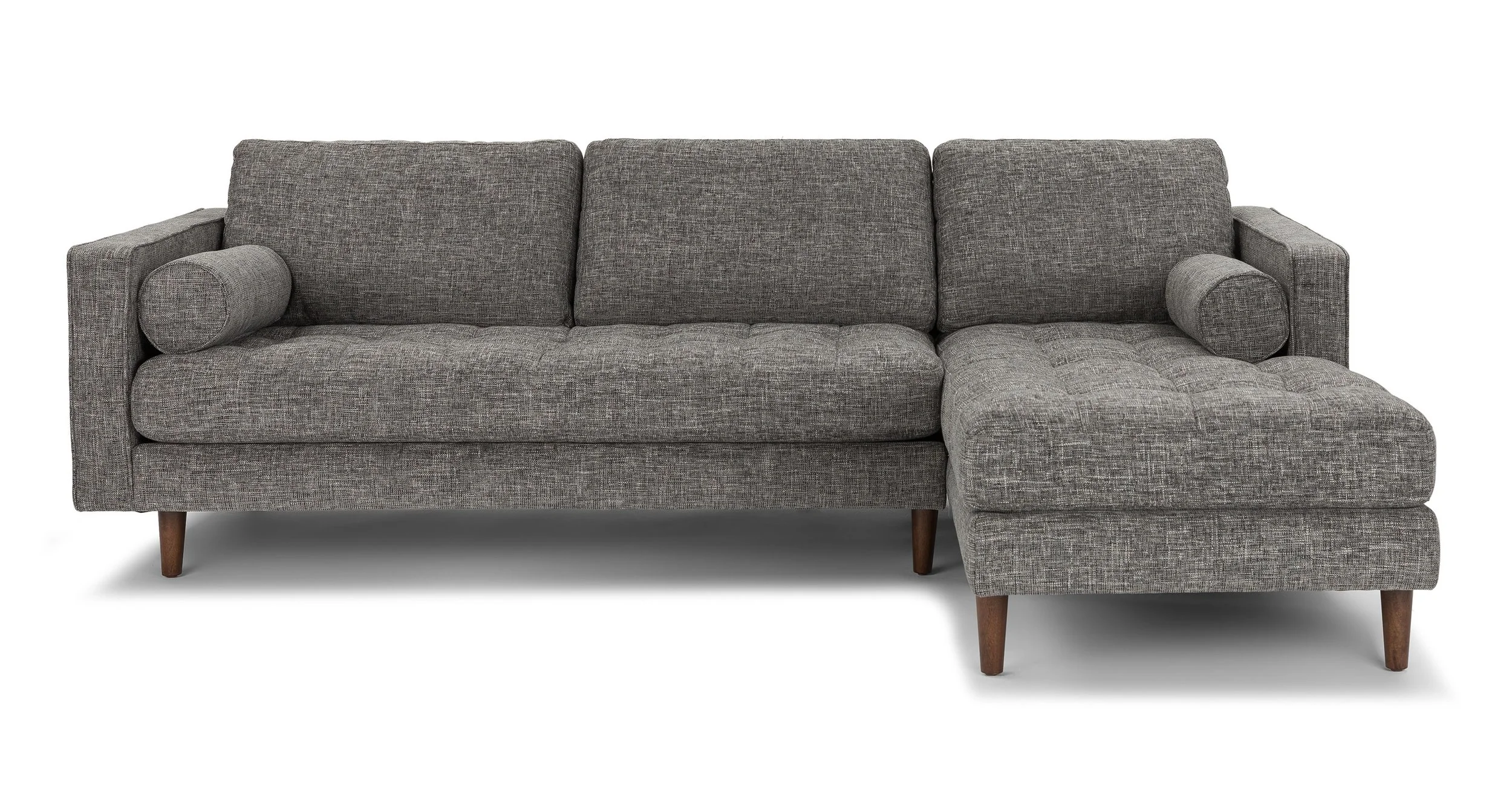
Situated at the rear of the main floor is the last zone in our linear tour, the family area. Extra cozy seating byway the Sven Sectional and an indestructible and rearrangeable leather ottoman make this the perfect place for supreme Lounge Cat Saturdays.
Seriously, the windows, the sun, that glorious light, they make my heart skip a beat.
I’ve used the Sven in a few different projects because it’s just so comfortable. Though I will admit, if a comfortably pulled-together sofa is what you’re after, the Sven doesn’t always deliver. I’ve noticed over time it does tend to lose its shape in the back cushions, and require a bit of finesse to return to its initial tidy appearance.
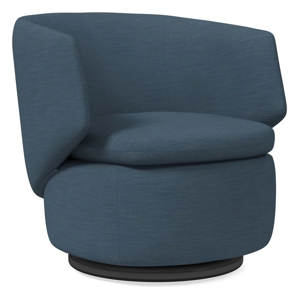
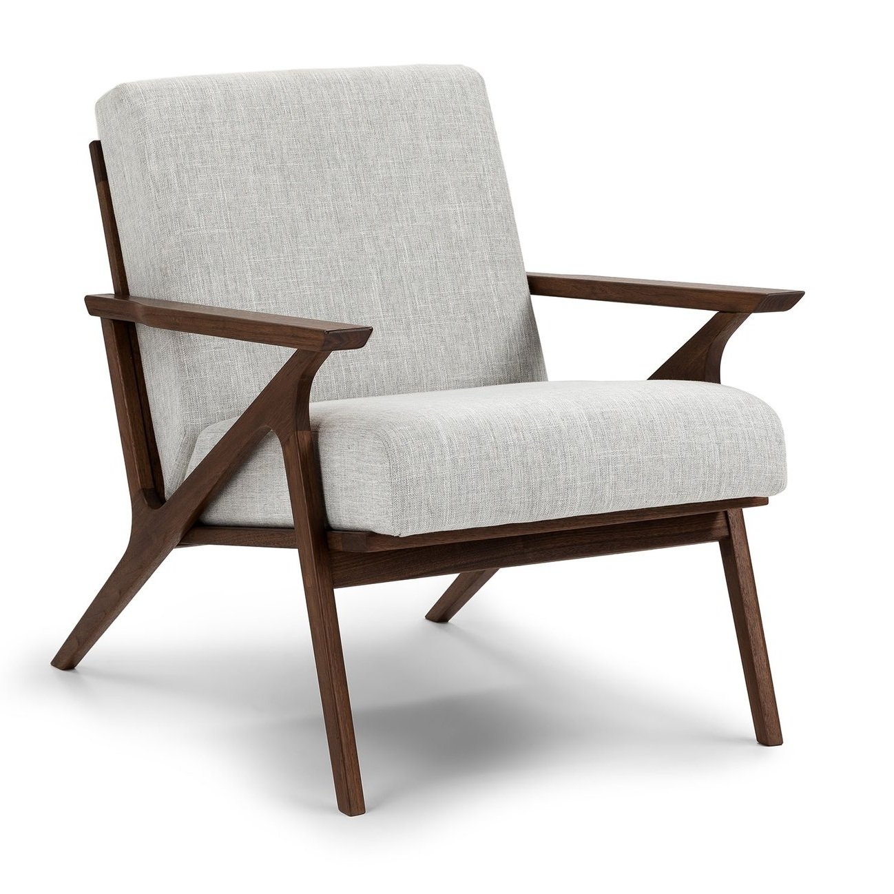
While the sectional is the main event, the chairs in the room play a necessary supporting role. A swivel chair in midnight blue sits ready for conversation or an easy spin for TV viewing. And the Otio Lounge Chair, a contemporary take on a midcentury classic, is angled to keep the space open and inviting.
This was a dream project to work on. There’s something deeply satisfying about taking an already beautiful space and helping make it a home. Thank you Darby and Andrew for entrusting me with the finishing touches.
All Photography: Bethany Gilbert
