A Riot of Color and Pattern for Beatrix's Nursery (Before & After)
It’s the happiest, most flamboyant room in the house! Despite my intense procrastination posting the finished space – once Bea was born, the few remaining projects took a backseat to actually using it – and unlike my typical slow-decorating, waiting around for the perfect thrift score to materialize process, it’s the only spot in our home to go from untouched to mostly completed in one go. I guess necessity (impending labor) breeds figuring out how to transform the Ugliest Room in Your House into something delightful, quickly, and on the cheap!
Curious why this room was once deserving of the Ugliest Room in the House moniker?
Living in a Victorian duplex has its charms! But a hundred and thirty plus years is a long time, ripe for inflicting careless and questionable "updates" on a once grand original design. At some point, like many other stately domiciles of its kind, our duplex had been turned into two separate apartments. This room became a second floor kitchen, then eventually was half-heartedly turned back into a bedroom before we moved in.
The remaining bank of upper cabinets lining the perimeter, along with a litany of other design grievances, kept me from ever even trying to make it a cute and functional room. We just filled it with junk from day 1 and never really looked back.
These before photos were all taken after I’d already cleaned everything out in preparation for painting, but I think the unpleasantness still translates.
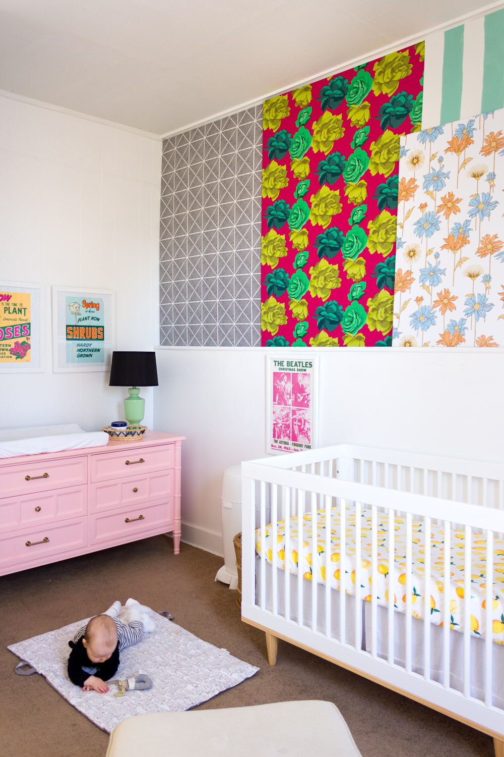
Now it’s lively and bright, a jolt of color and explosion of patterns for our baby girl! And this view is first as you walk through the door!
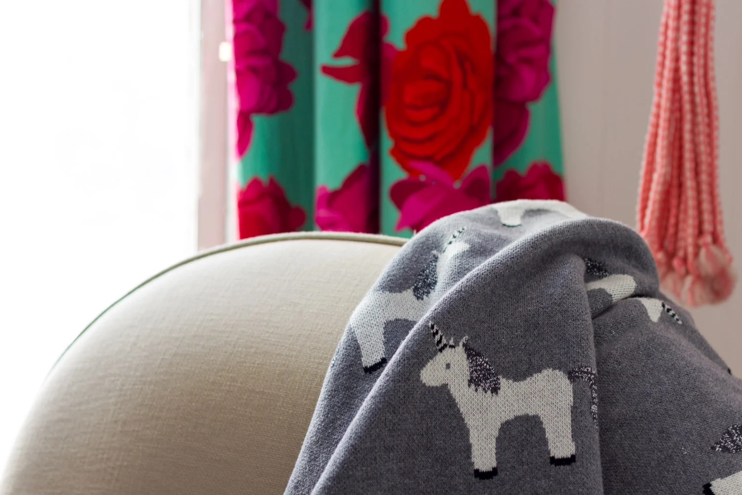
In keeping with the rest of the house I banished the existing buttercream yellow walls in favor of a blank slate: Du Jour by Valspar. And from the beginning I knew I wanted to dedicate this corner to a cozy glider and statement-making curtains. Every time I passed by the opened door, my heart would skip a beat imagining the little soul I’d soon be rocking the night away with. Nurseries have a way of making everything sentimental.
But gliders are sort of a necessary evil. Even if you spend a fortune on a swanky “modern” model it’s still pretty rare that it’s actually attractive and comfortable. I dedicated way too much time looking for something inexpensive and aesthetically inoffensive, ultimately ending up with this Craigslist find. It’s not winning any awards, but it is probably the most comfortable piece of furniture in our home so I’m counting it a win.
Speaking of sentimental, I found the below print at a junk shop years before we’d even seriously considered having a kid. Ever drawn to high contrast and kitschy vintage (I have a look!) it was perfect for a future nursery so I tucked it away not knowing if it would eventually have a place. Like many others, our journey to parenthood wasn’t seamless or immediate, so stumbling across this infantine artifact during an organizing binge often induced a surprising surge of heartache, but sometimes it acted as balm for weary uncertainty, too.
I basically planned the whole room around it.
I’m 10 months into this parent thing and my biggest takeaway is that baskets are the lynchpin on which having a kid and retaining any semblance of a cute home hinges. Baskets for toys, for baby blankets, for outgrown clothes, for books. I found this one at HomeGoods and added the neon poms as an easy tiptoe back into crafting right after Bea was born.
But the biggest positive impact in the room comes from covering up those horrifying kitchen cabinet uppers. For such an inexpensive and easy DIY solution, I’m very happy with the outcome.
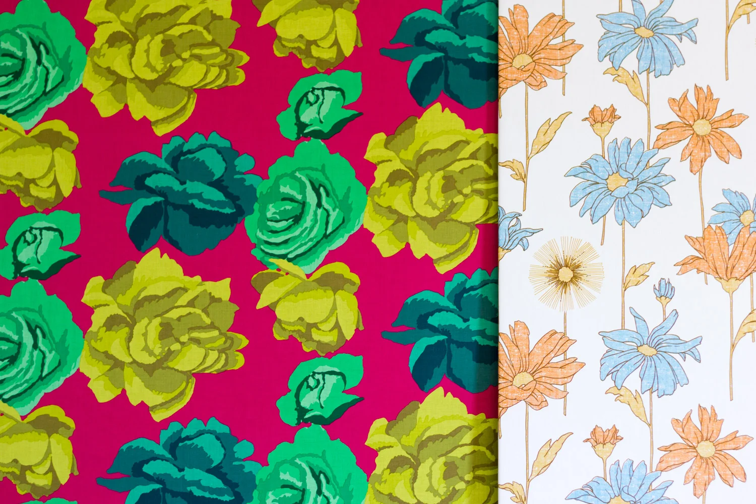
Fun fact, I wasn’t sure which colorway I wanted to use for the rose-printed curtains so I ordered both. Then I fell in love with both, obvi, so decided to use the chartreuse to cover one of the panels. The process was simple: remove hardware from cabinets, have inexpensive sheets of hardboard cut to size at Lowes, tightly wrap and adhere fabric to back of panel. I just used a glue stick because I was pregnant and didn’t want to deal with anything with strong fumes. Then I went back and stapled it in place to ensure a very snug fit.
The mix of patterns was all based on what I could source quickly, affordably, and would work with the Rose print. I found the grey and white geo print fabric on sale at Joann’s, the smaller floral panel is covered in vintage wallpaper from an estate sale a few years ago, and I painted the green stripes with an old can I had on hand. And if you’re worried about a falling panel incident, don’t be. We screwed them directly into the cabinetry behind. They’re not going anywhere.
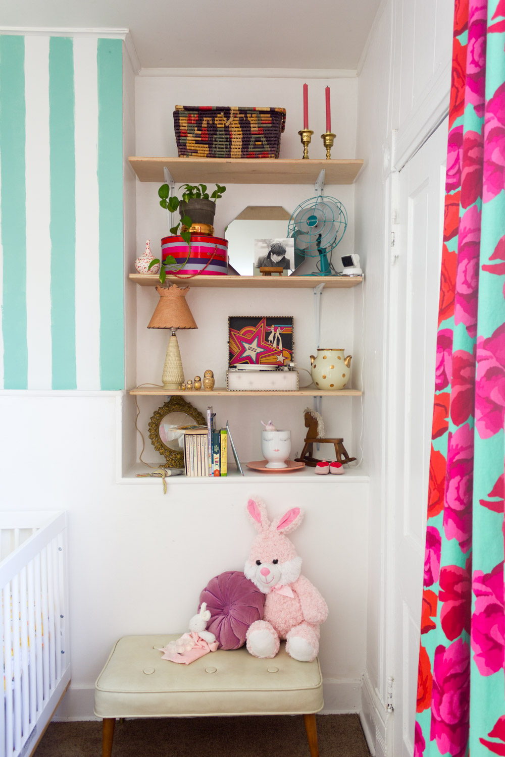
To fill the weird little nook on the other end of the wall I made some shelves. And by “made,” I mean had Lowes cut down some plywood that I attached to white metal brackets – a nod to the crib’s white/natural wood design. Then I packed them with all the cute trinkets I could find because is a nursery a nursery without a set of styled shelves? Oh, and about the crib, I wanted it to be super simple, but still interesting ….also, affordable, of course. Do I sound like a broken record? I decided on the Marley 3-in-1 Convertible Crib and my sweet friends Laurel and Glenna surprised me with it as a shower gift!
This lamp with its perfect blush-toned fiberglass shade was the sweetest gift for Beatrix from my friend and vintage shop owner, Tiffani. I just adore it!
And at some point during the nursery process I unearthed a new-to-me photo of a post high-school Luke, looking all 1960s folk-scene, man of my dreams. So, naturally, that when on the shelf too.
The peach vintage dresser I madeover is the room’s workhorse, consistently proving its value. Beside it sits this vanity chair (another makeover I hope to document soon) because nothing says Baby like red tufted velvet. Really, I just wanted something for this little sliver of a wall and had my heart set on finding a red heart-back chair. When that didn’t materialize I decided to take matters into my own hands.
Post forthcoming.
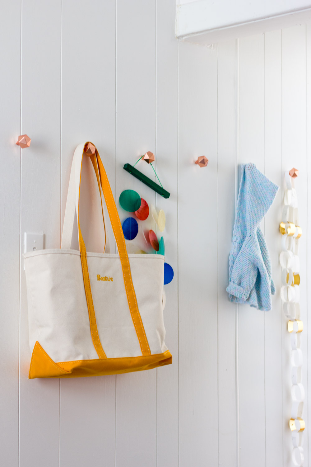
This wall at the entrance to the room stumped me for a bit. Almost immediately I thought about adding some type of hooks, but kept second-guessing the idea because I couldn’t imagine I’d actually have anything to hang from them. I’m so glad I did it, and sort of amused by my lack of foresight. This is pretty tidied for photos, but in real life they’re constantly full with bath towel, outerwear, bonnets, and, yes, that paper garland lives there full time. Also, that LL Bean “Beatrix” emblazoned tote, another A-M-A-Z-I-N-G gift! Thanks, Ross and Gina!
I’m so happy with how this room turned out and grateful to the friends who encouraged me to attempt some magic when I struggled to see past the original eyesores. Made up of approachable DIY solutions, affordable furnishings and the most generous gifts from friends, it’s perfect for our Sweet Bea.
