Retuned Traditional Living Room – Reveal!
This project stars a Mid-60s Traditional Two-Story – home to my client Ashley, a trained violinist, her husband, and their three young burgeoning virtuosos. Music is a big part of her family’s ethos! They wanted a space primed for comfortable entertaining, plus playing host to daily violin and piano practice.
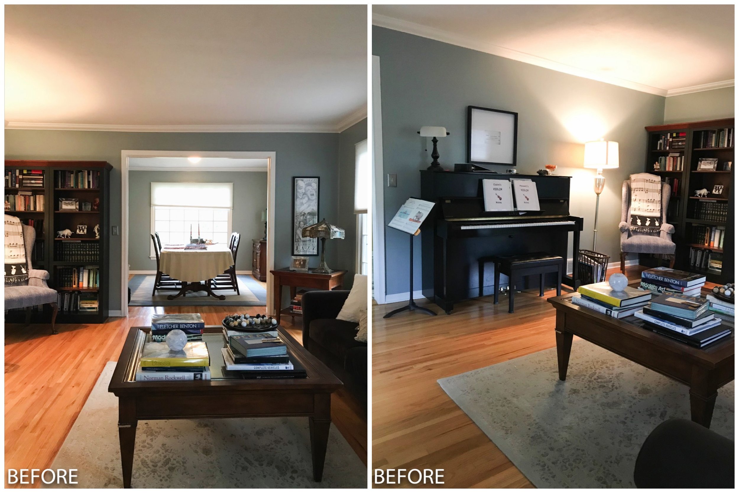
She reached out to me last October (hence the halloween decor!) about creating a cohesive design for her living and dining rooms. They only had a few requests, that I incorporate some recently inherited pieces of furniture, and keep the existing paint color; everything else was open to change!
My approach was to mix their inherited traditional pieces of furniture with some simplified midcentury-influenced items, resulting in a space that felt collected, unique and still cohesive.
Grounding the room with a larger 9x12 area rug was the starting point. I chose this beauty from Pottery Barn for its traditional pattern and perfectly muted warm hues. Next was sourcing more seating furniture. Their existing arrangement included a sofa – which they valued for comfort, but stylistically felt could use an upgrade – and two tall wingback captain’s chairs from the antique dining set they’d been given. With a larger rug in the mix the furniture could now move in from the corners of the room, creating a cozier arrangement to better facilitate conversation.
Like the rest of the internet I’m having a bit of a love affair with Article. I’m not some stealth brand ambassador, just genuinely thrilled to find a company with great designs, at really great pricing all because it means I can stretch my clients’ budgets as far as possible.
I selected the Burrard Sofa and side chair in different but coordinating colorways to keep it interesting.
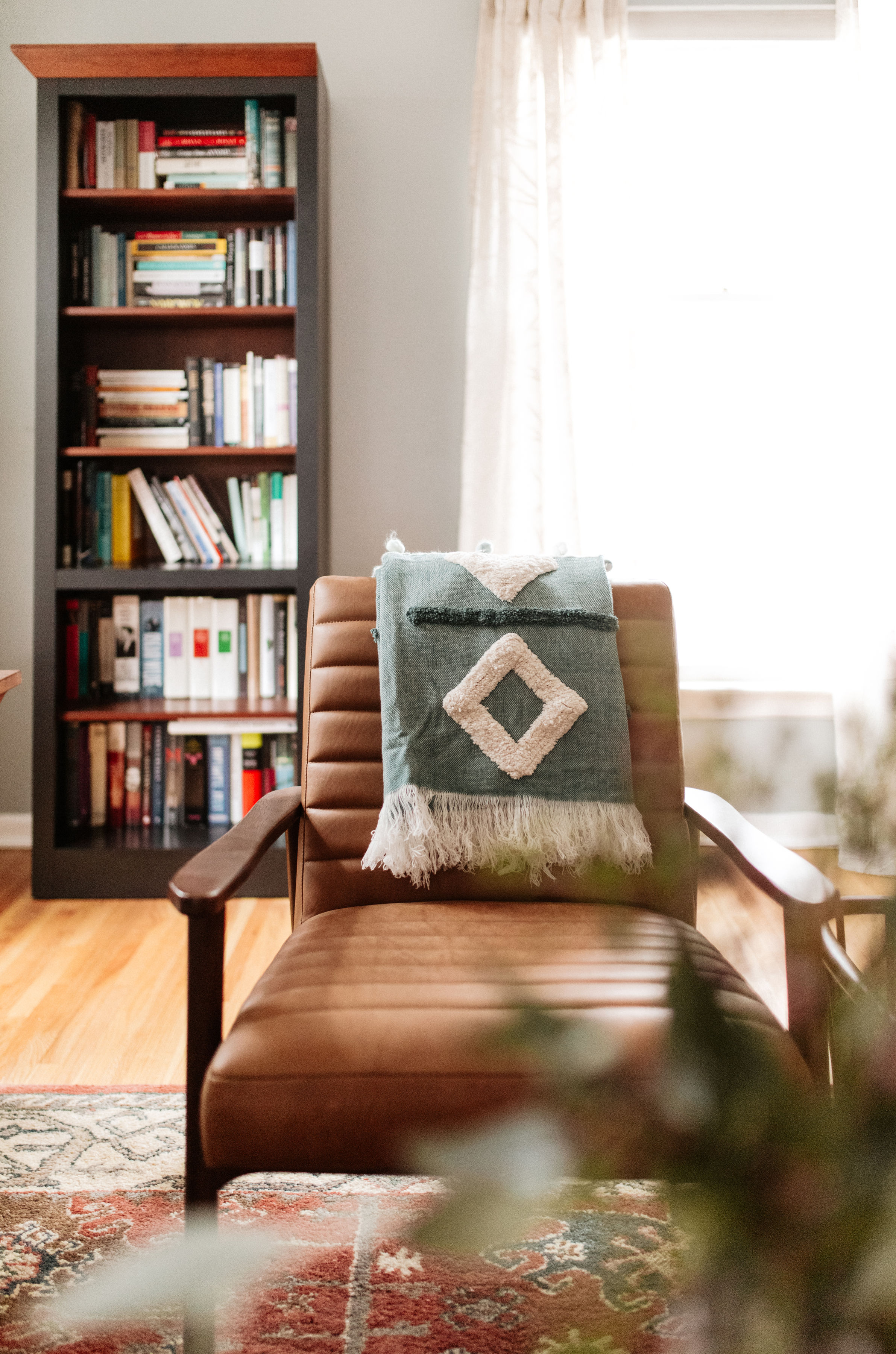
The Thetis lounge chairs in channel tufted cognac leather with walnut frames round out the arrangement.
Art with presence is such an important part of a well-appointed room. And I got really lucky because Ashley and her husband enjoy sourcing meaningful pieces locally whenever possible. Before making a decision on something for the wall above their sofa they wanted to hold out until they’d had a chance to visit the upcoming Bemis Center Art Auction. When Ashley texted a picture of the large-scale graphic still-life they’d purchased, I was giddy! Bold, mod, and the perfect amount of whimsy juxtaposed with the other traditional elements, it makes the room.
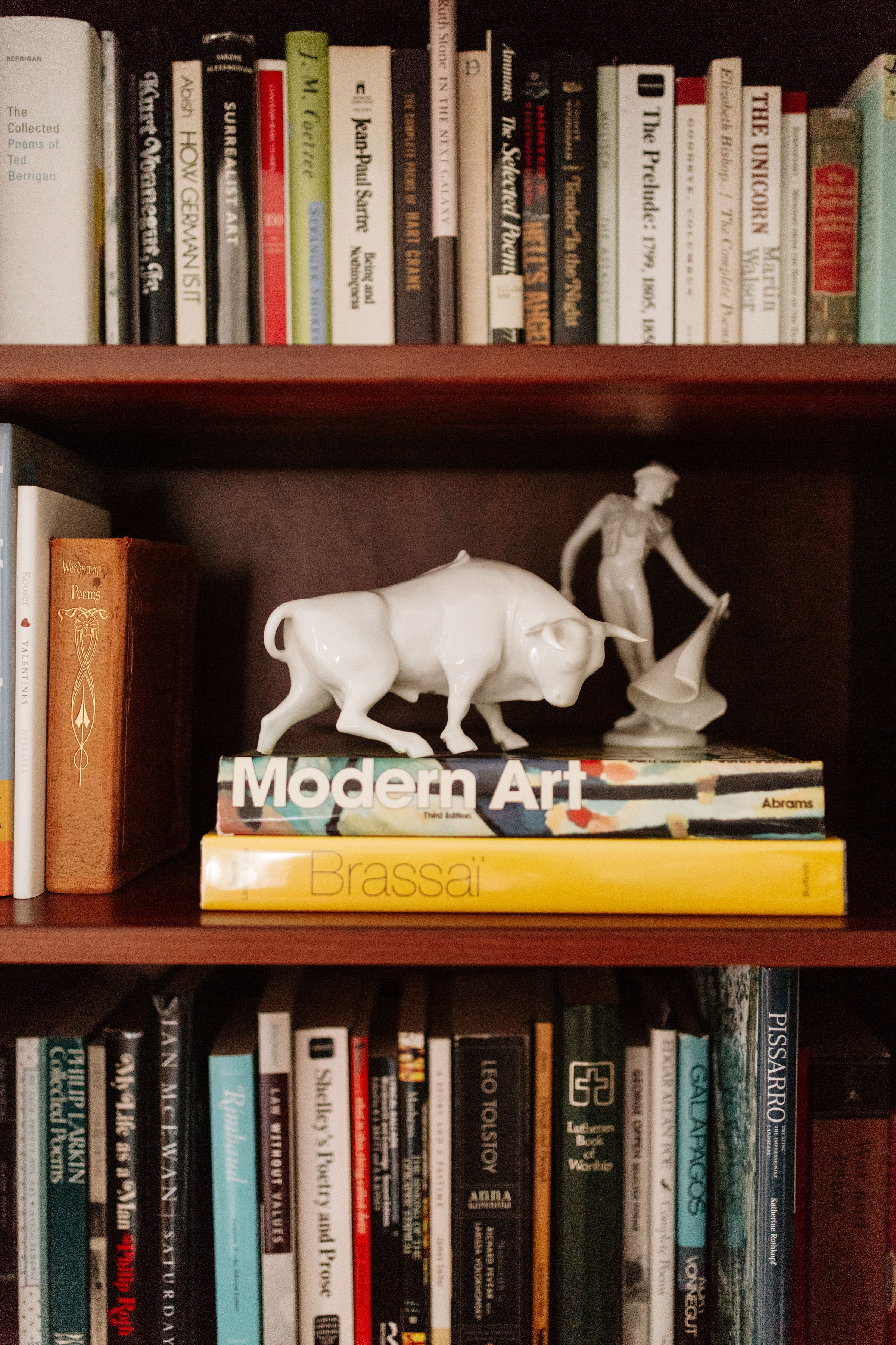
As a writer and editor married to a former English Major, books occupy a large presence in Ashley’s home. The two tall bookcases they owned functioned well in storing a sizable portion of their collection, but their side-by-side placement wasn’t utilizing the space as best it could. Splitting them up so they now flank the window along the opposite wall gives each bookcase more breathing room and creates a bigger impact.
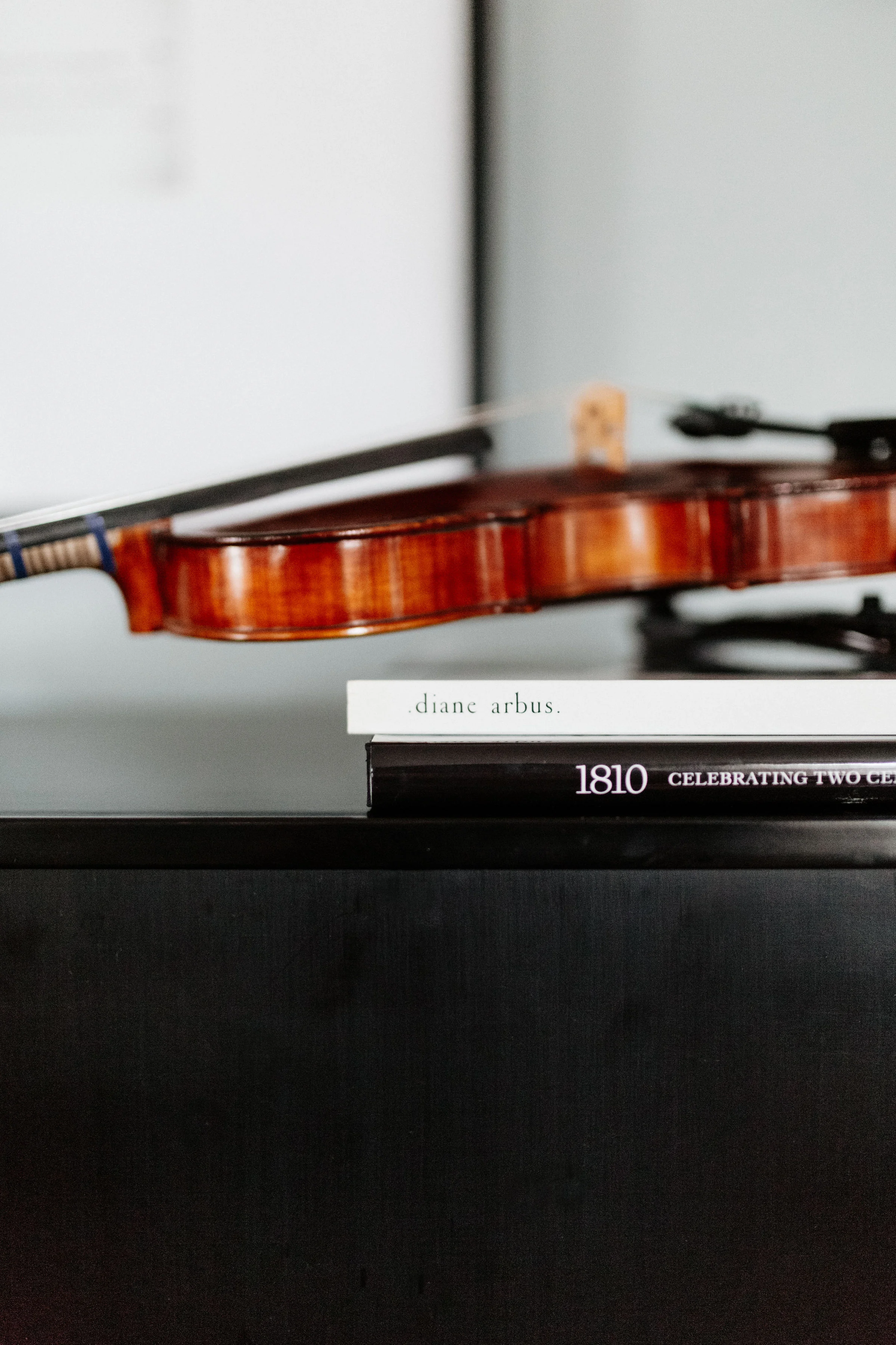
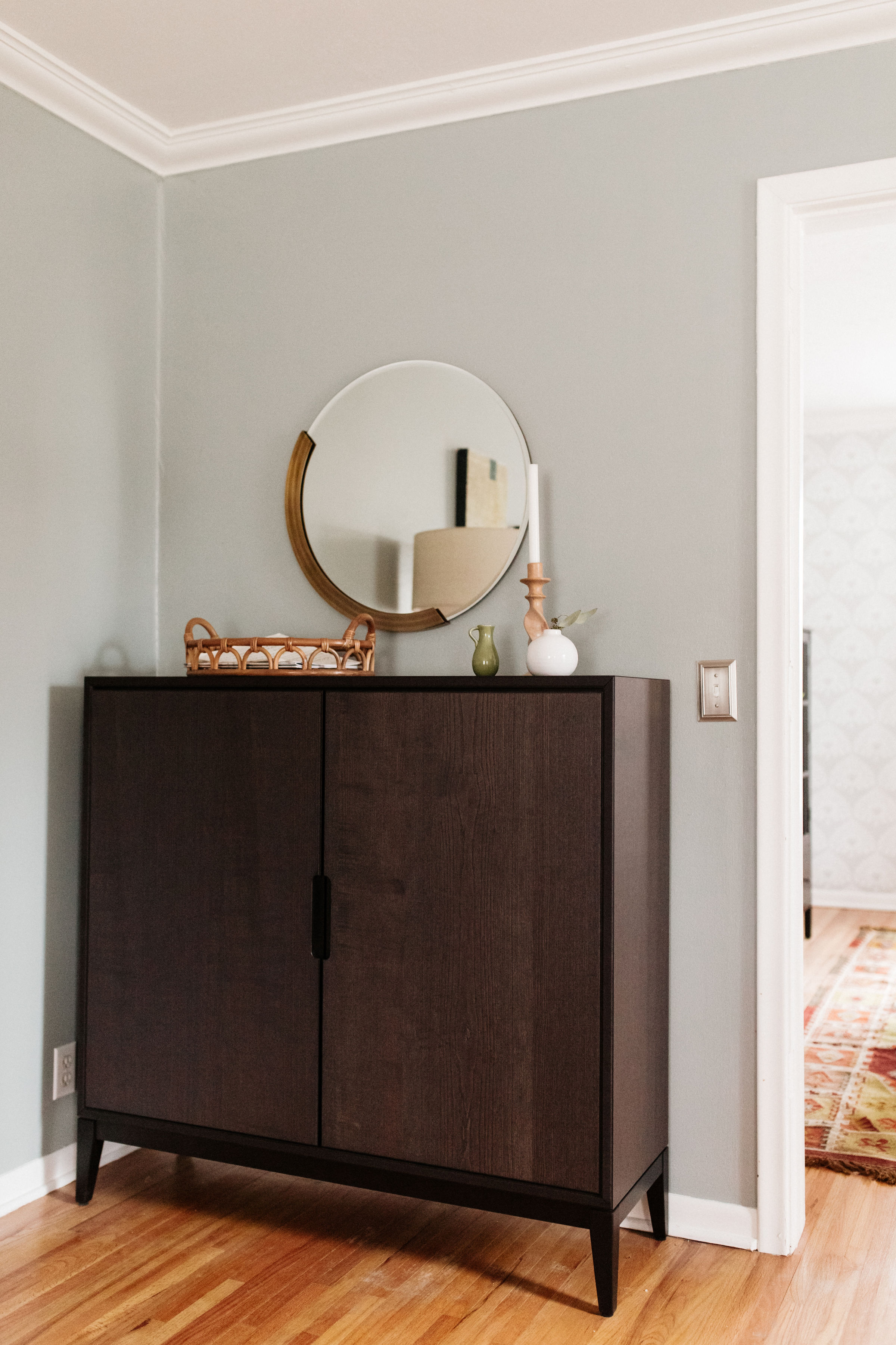
And by relocating the bookcases, I was able to incorporate some much requested music storage. Previously, Ashley’s and her kids’ instruments called the floor in the corner of the dining room home. Now, in that single Ikea Regissör cabinet, one full size violin, three 3/4 size violins, plus a slew of Suzuki Method books and other musical texts and workbooks all cozily cohabitate.
With some additional lighting via floor lamps, a new cantilever lamp atop the piano, and a more prominent position for their passed-down Tiffany-style light, a warm and even ambience now fills the room. It’s the perfect setting for afternoon lessons, getting lost in a weekend novel, or care-free hospitality.
I’m so happy with how this living room turned out! It’s casual and inviting, but still packs an understated punch. Check back soon (but maybe like in a month…) for the dining room reveal!
Photography: Emma Morem


