Modern Colonial Dining Room Reveal
Ok, let's acknowledge the obvious. I have a thing for green dining rooms, I guess.
A few weeks back I revealed Katy and Josh's completed entryway. Just as with their entry, Katy's affinity for traditional design coupled with a healthy dose of lighthearted joviality steered the overall direction for the dining room. This room wasn't actually part of the original scope of the project, but as I worked on the adjacent entryway I naturally started to form ideas on how we could easily refresh this space too.
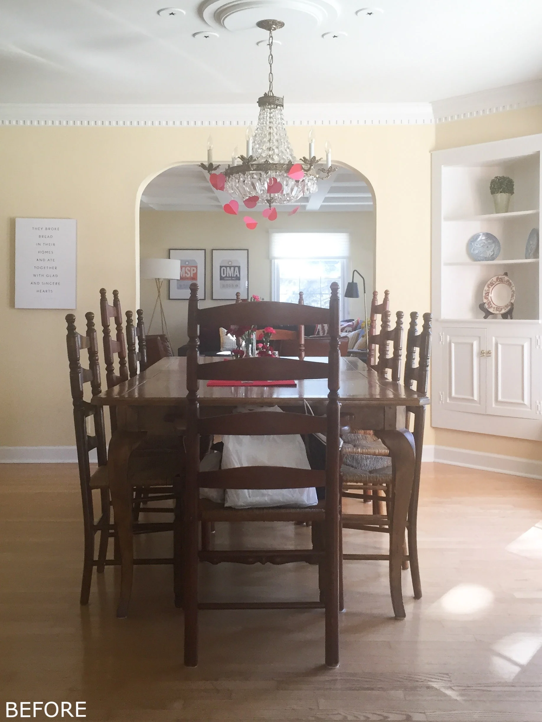
Here's what it looked like at the start:
Like the original entryway wall color, the pale yellow wasn't doing much to highlight the room's architectural details. And the chandelier, though pretty, felt too ornate for the classic vibe of this 1950's Colonial. Then there were the corner built-ins – totally ready to make a bigger statement.
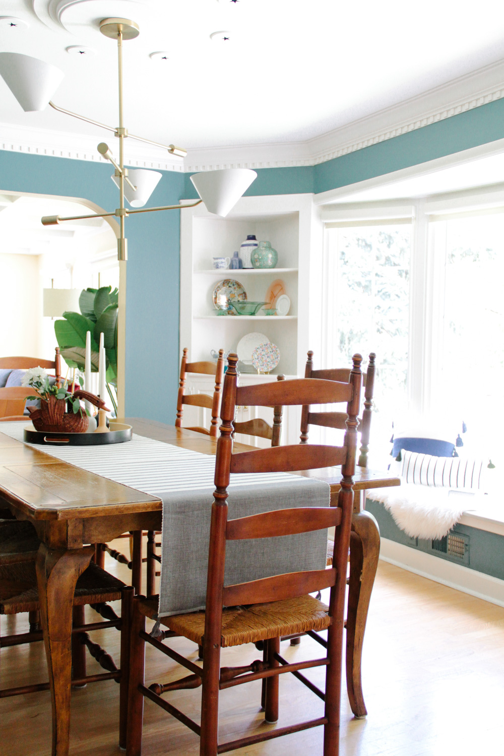
The decision to go green on the walls (Benjamin Moore Polished Slate) came after Katy mentioned her love for the deep hued color early in our discussions for the entryway design. Considering that area's limited natural light, I worried it may feel too oppressive. The adjoining dining room however, with its large west-facing bay window, was the perfect candidate.
I love how it calls attention to the beautiful molding and trim, while also seriously amping up their existing dining table surrounded by rush clad ladder back chairs. The rich warm wood tones now shine against the vivid background.
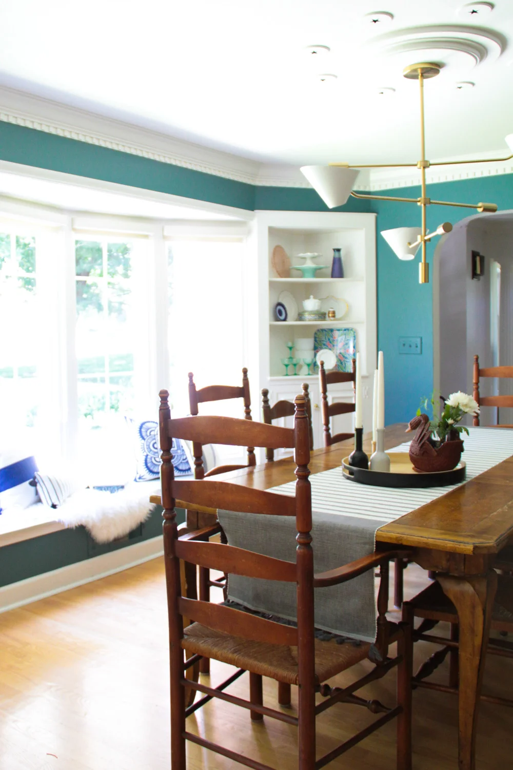
And a space like this filled with mostly classic furnishings could afford some contrast! The juxtaposition of the rustic colonial dining table with the modern streamlined silhouette of their new West Elm chandelier is perfect.
Just like the entry, I wanted the art and accessories in the dining room to reflect Katy's affinity for pops of playfulness. To inject some of that We Don't Take Ourselves Too Seriously whimsy into the space, the corner built-ins were filled with a lively assortment of colorful tableware and decorative accessories.
Comprised of both accessories and dishes Katy already had on-hand, with the vintage and novelty pieces I slowly collected over the course of the project, I love how each seemingly disparate piece works together as a whole. A patterned ginger jar makes nice with an amateur potter's handiwork. Depression era serveware commingles seamlessly with dotted Kate Spade dessert plates. And a quasi fabergé egg is, of course, completely at home nestled in the mix.
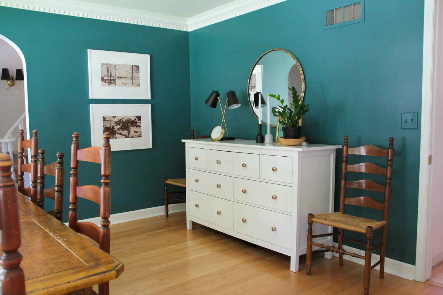
On the opposite side of the room, their existing white dresser/buffet remains, but updated via new accessories and a less formal approach to the styling. The affordable task lamp from Target lends a sculptural quality, plus it relates so well to the brass with black shades sconces in the entry. And I'm especially partial to that thrifted horse print – and not so subtly wishing I'd kept it for myself...
You may recall the round mirror was actually hanging in their entry before I swapped it out for a taller rectangular option. Here, in its new home, the scale works much better and its placement across from the window happily bounces even more light about the space.
The two prints below, featuring scenic images of Okoboji, Iowa, held special meaning for Katy as the place she'd grown up vacationing through her childhood, and continues to now with her own family. She'd been hanging onto the images for a bit, but they'd yet to find a wall to call home. This felt like just the spot.
To keep costs down Katy used economical RIBBA frames from Ikea, then had custom mats made to fit the nonstandard image sizes – a budget-friendly way to achieve a polished look.
I'm so happy with this cheery dining room refresh! In the end it's a great example of how it's not always about an overhaul; small changes and updated styling can also be transformative.
Photography by: Bethany Gilbert


