The Grown-Up Bohemian Dining Room
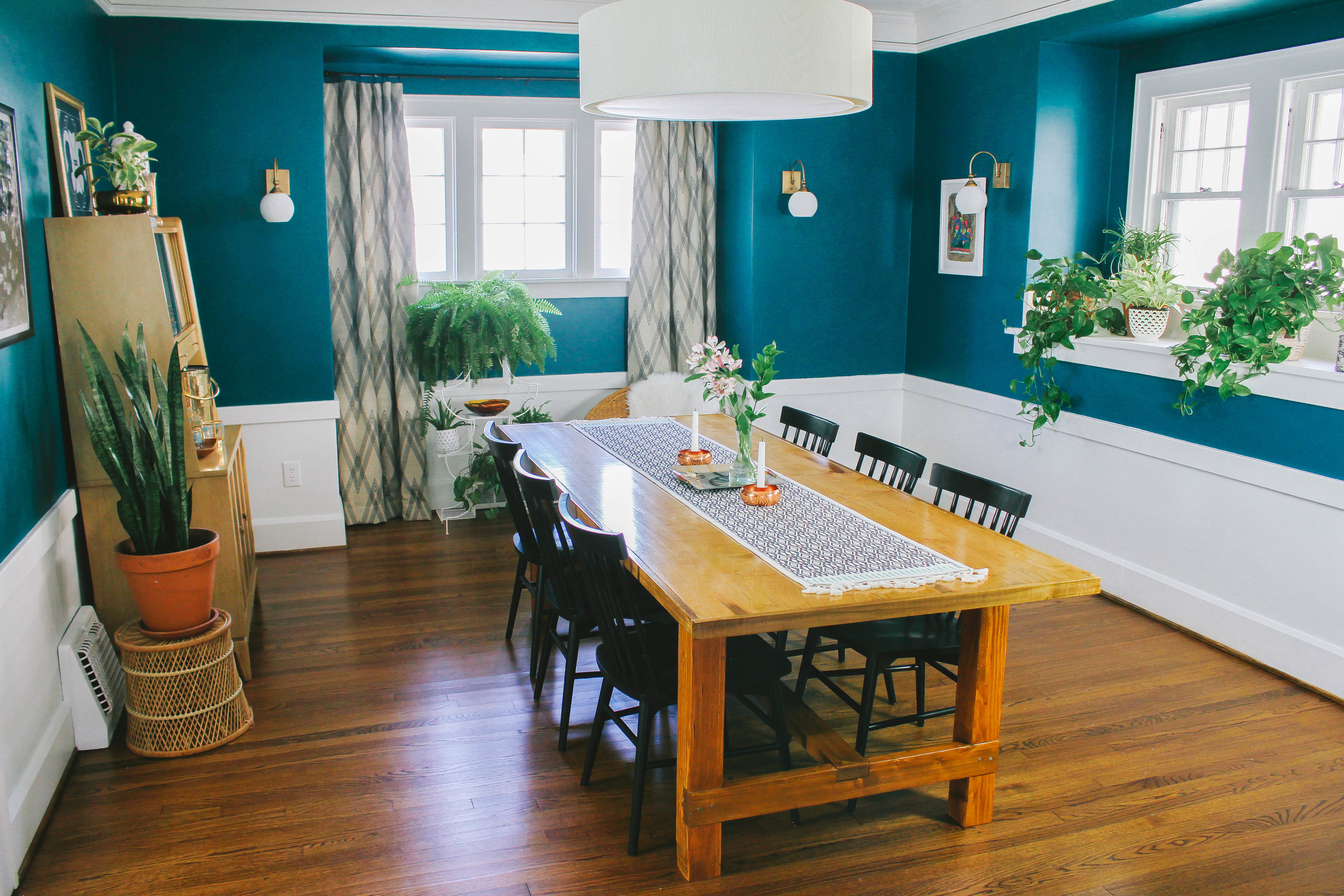
Situated just off of the living room, it made sense to keep the Bohemian party going in clients Darby and Andrew’s dining room. And so we did!
For a family well-seasoned in hosting and entertaining, their dining room was a great size full of charming architectural details, just not a ton of personality or warmth. Much like their living room I wanted to amp up the character and add interest. Ensuring the two rooms flowed well together was priority, but I envisioned the dining room a bit more restrained in its color palette and styling – a sort of Scandinavian/Bohemian blend.
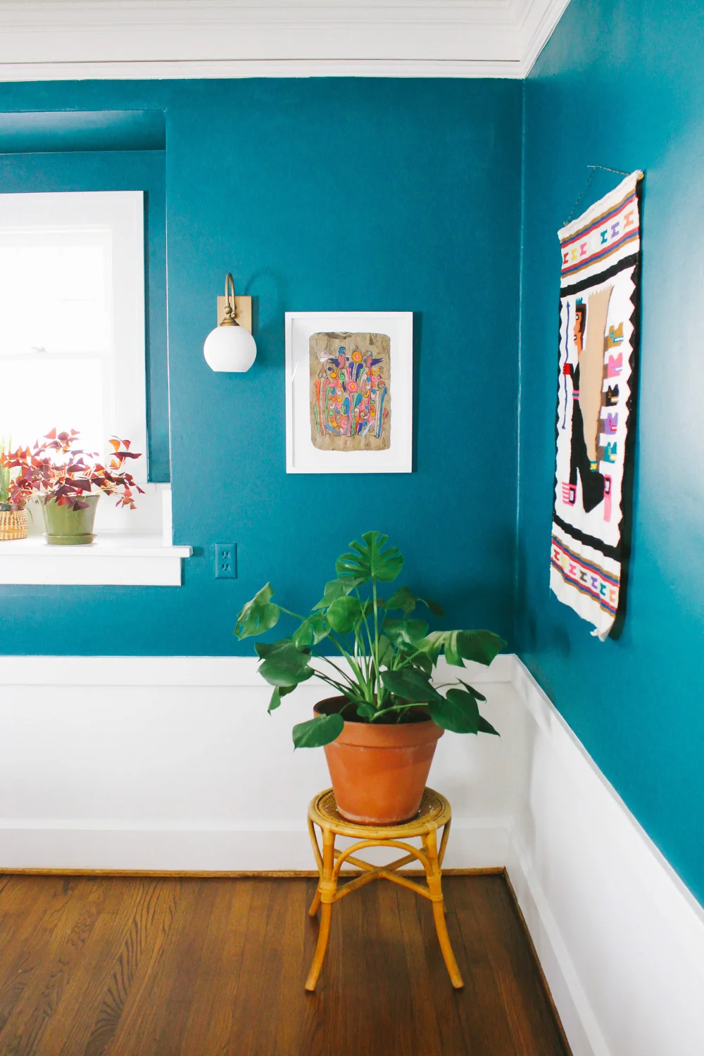
The original pale robin’s egg blue wall color wasn’t doing the room justice. The chair rail and other original moldings weren’t being featured and the room felt expansive rather than inviting. Painting the top portion of the walls Valspar's Sensual Jade immediately added some dramatic oomph and instant coziness!
The original sconces were another element in need of some attention. Each of the four fixtures operated independently from one another – the on/off ability achieved only by way of a brave oven-mitted soul tightening or loosening the bulbs. Darby had already looked into the installation of a light switch, but was informed that combining the separate wiring on all four light fixtures would be cumbersome and labor intensive (plus entail extensive destruction of the plaster and lath walls). Instead, she opted to forgo that route in favor of new sconces with local on/off operation.
We chose the Plum and Bow Alba sconces from Urban Outfitters (sadly sold out now) because they had built in switches. Originally meant to be plugged into an outlet, Darby's electrician easily hardwired them into the wall instead and they fit the space like a dream. They're understated with a vintage vibe that fits so well with the house; and the brushed brass with that wall color just sings.
The two prints on either side of the sconces are some of my favorite elements in the room. My friend Tiffani offered up the print on the right from her personal collection because it looked so much like the ones I'd shown in the mood board. A few weeks later, in a bit of kismet, I stumbled across the one on the left while at an estate sale. Upon further research, I discovered they were derivative of an ancient Mexican paper craft called Amate – this specific style popularized and made readily accessible in the 60s. Framed in some affordable 11x14 frames from Target they look punchy and modern.
One of the first things you see upon walking into the room is the adorable window alcove. To up the impact and also define its purpose a bit more I created a solo seating area – tucked just slightly away and privy to that tranquil early morning light, it’s a spot for savoring the last drop of coffee and last bit of quiet before the rest of the house comes alive. I made the curtains out of a Nate Berkus upholstery weight fabric, plopped a vintage wicker Acapulco chair down, and filled the rest of the space with plants from Darby's teaming collection.
Also, I BUILT THEIR DINING TABLE!
After months scouring craigslist for a light or medium-toned, simple, dining room table that could easily seat 8+ and was within my price range, I gave up and decided to just build it. I'm no carpenter, and this table is far from perfect, but I guess I'm naive and just foolish enough to tackle these tasks when unable to find the right peace ready-made.
An entire post dedicated to the foible-ridden tale of its construction is forthcoming.
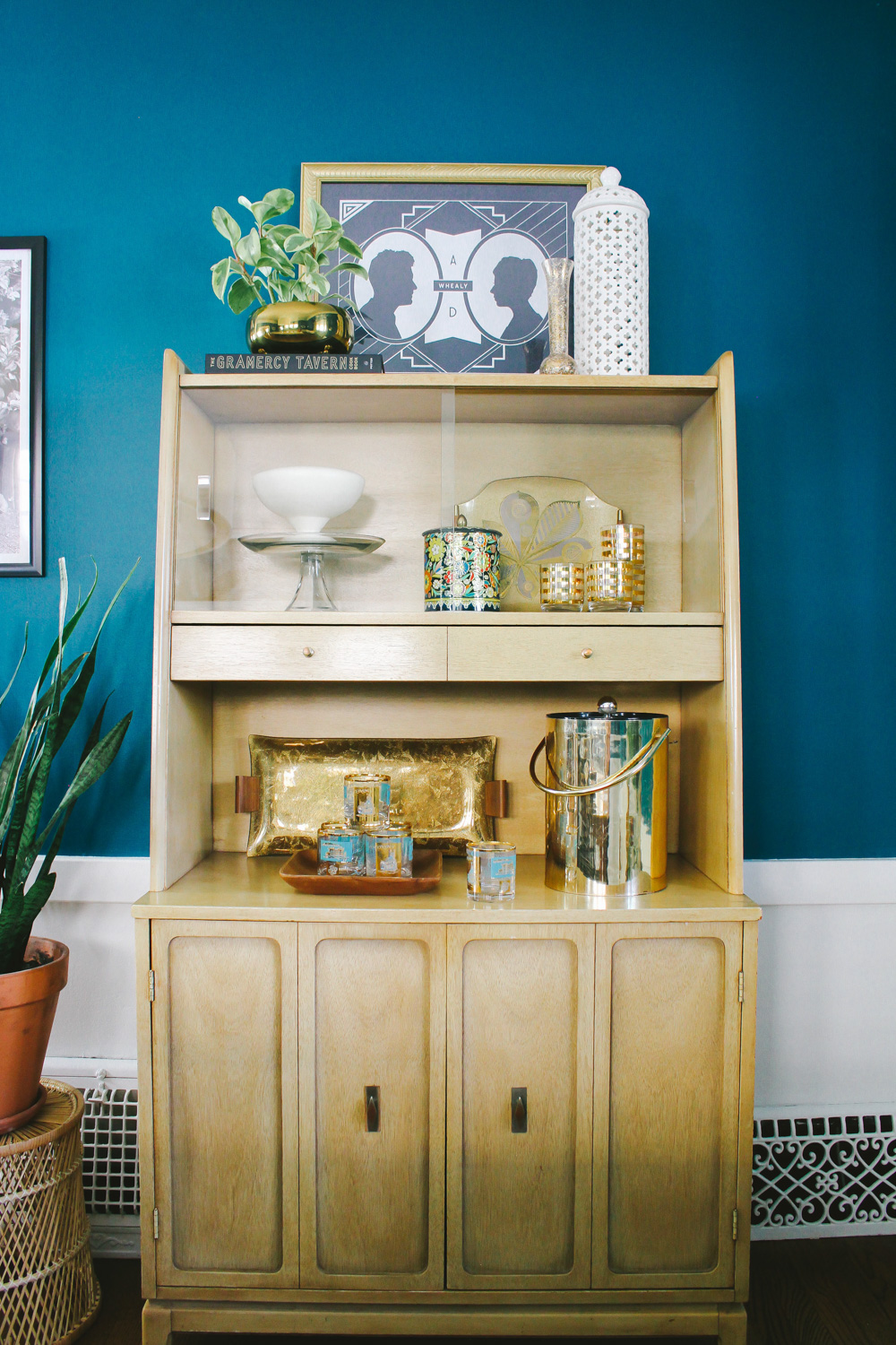
Actually, so much of this design process revolved around hours of obsessive Craigslist searching. I'd find the perfect piece only to discover it was already sold, or it was located in a small town 4 hours away, or it was just slightly too big, too small, or most often too expensive for the space. Luck finally came through when I discovered this darling petite hutch – perfect color, perfect shape, perfect details.
In the end all of the thrift-store scouring, second-hand sourcing and questionable (on my part) construction projects paid off. Full of untapped potential, this former underperforming room is now a showstopper!
I mean, swathed in a color named Sensual Jade could you really expect anything less?
* Thank you Bethany Gilbert for the incredible AFTER photos!


