Tonally Traditional Family Room – A Multi-Use Room Goes Cozy and Cool in Layered Shades of Blue, Grey, and Green
A slight departure from my typical bold color, multi-pattern, quirky vintage MO (don't worry, it's still there, just in more measured doses), it was a thrill to work in a more refined direction and create a space that's both serene and stately, with just the right amount of we-don't-take-ourselves-too-seriously coziness.
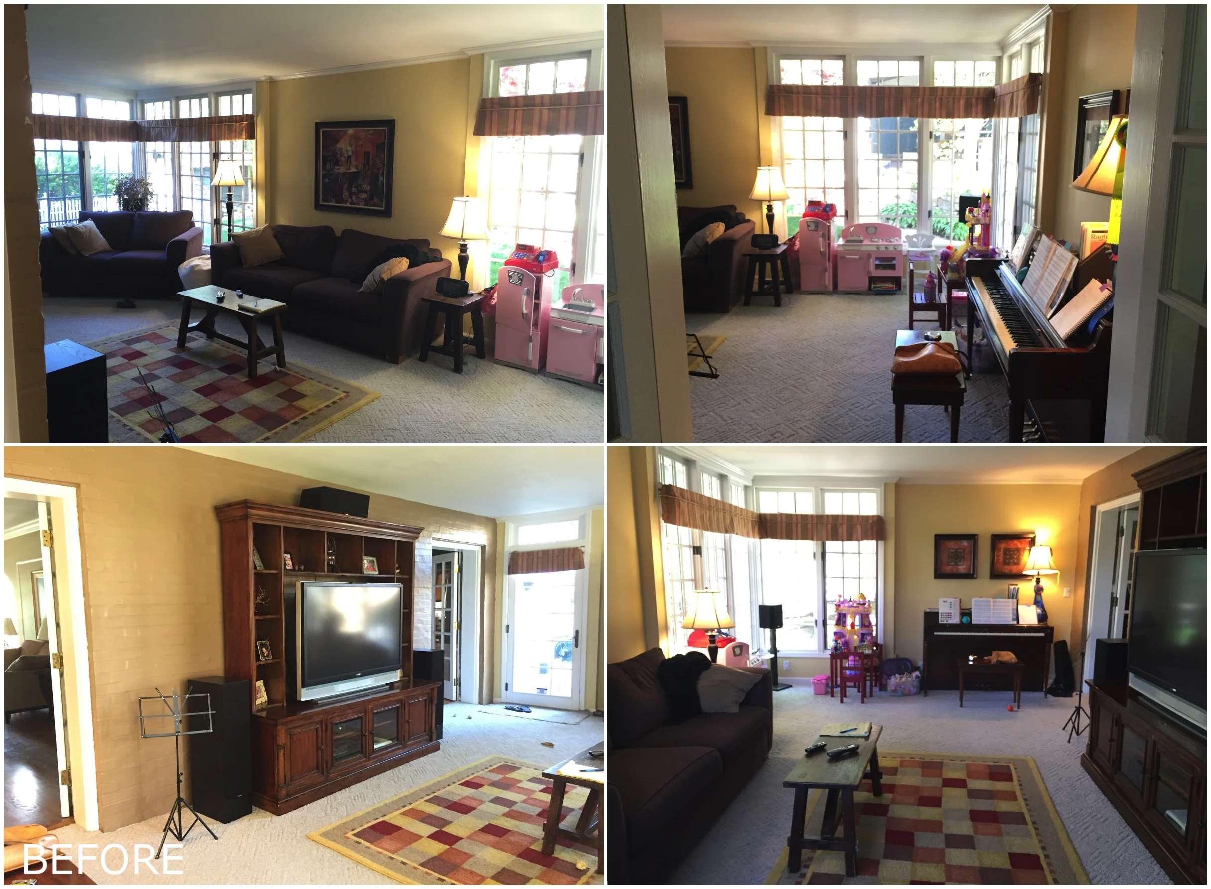
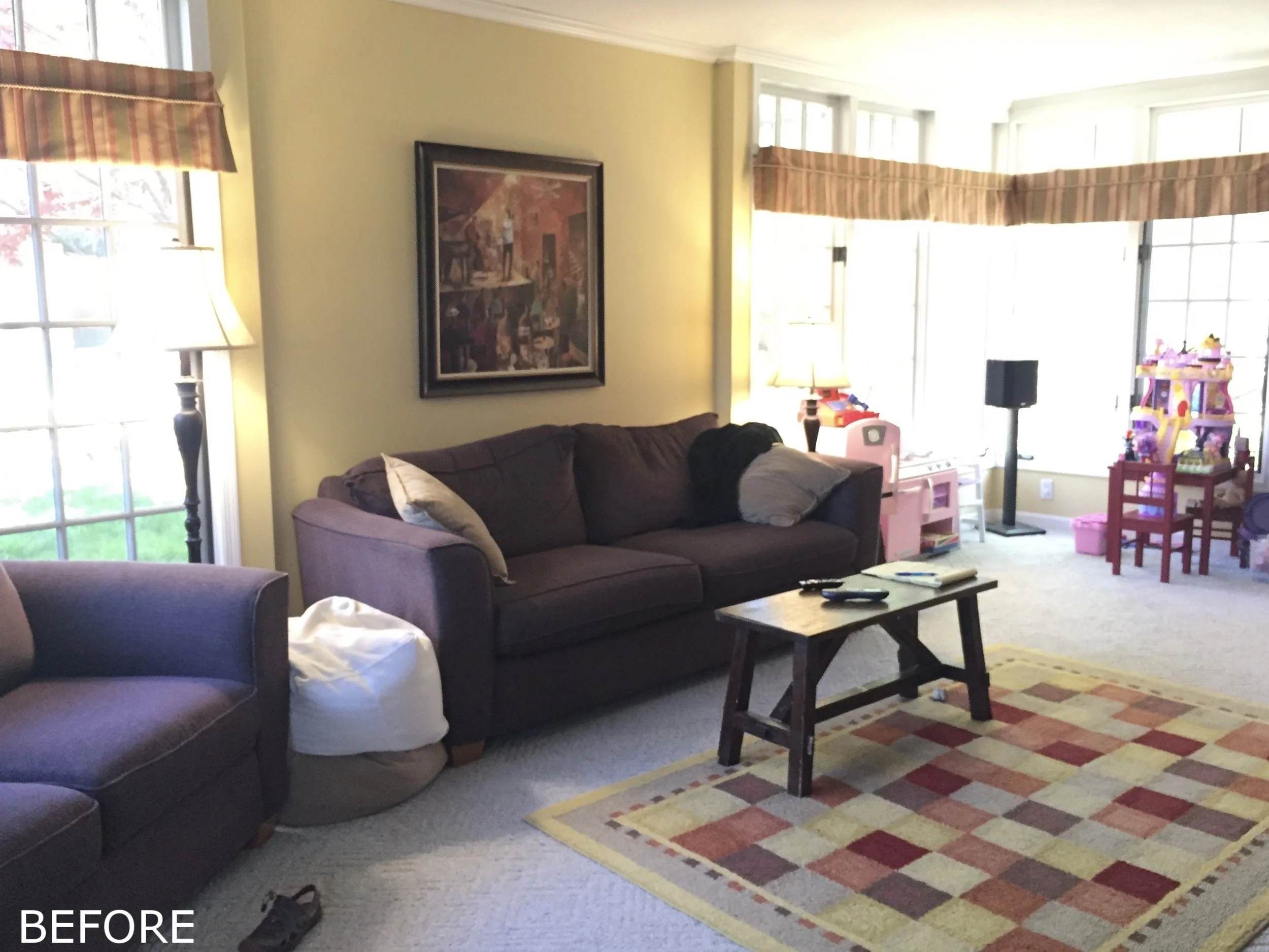
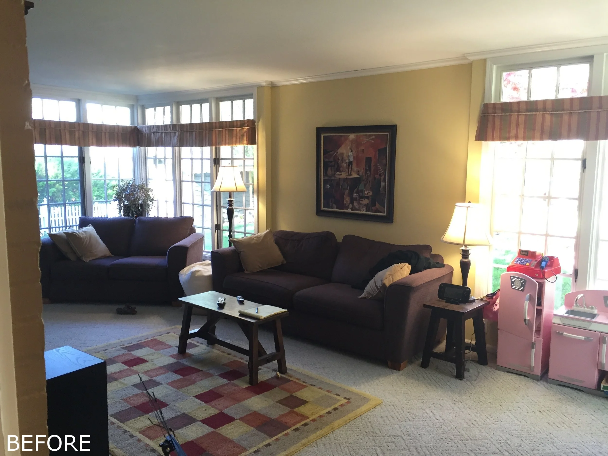
Let's look back at where we started.
One of the last remaining spaces in their home to be decorated, Adrianne and Charlie's family room housed much of the leftover furniture they'd accumulated over the years. The window treatments were a remnant from the old homeowner, and the carpet had seen better days. It wasn't at all indicative of the chic stylings in the rest of their classic whitewashed brick colonial. But despite it being last on the list for an update it was probably the most used room in the house – family game nights, movie marathons, piano and saxophone jam sessions... It was important that it be a family friendly, cozy retreat, yet still incorporate the traditional aesthetic of the rest of the home.
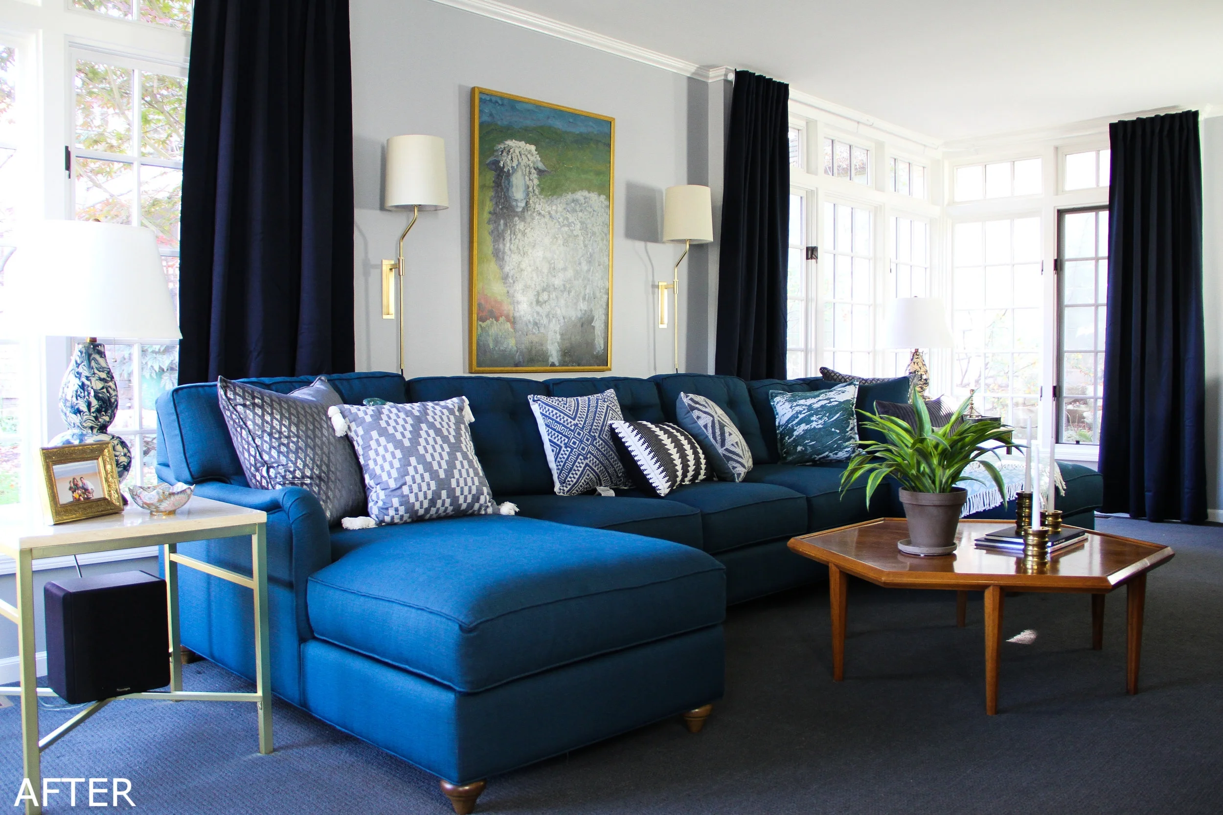
Now it's a calming haven with a soothing color palette of blues, greens, and greys – colors all close to each other on the color wheel. And the focus is on the nuanced differences between each tone rather than my usual high contrast approach, hence: Tonally Traditional Family Room.
The long and narrow layout of the room navigated the design. And the covetable floor to ceiling corner windows made playing up that symmetry the best course of action.
Arranging seating to promote good conversation flow is typically most important. But for a room where one of the highest objectives is to melt into a heap on the couch, remote in hand after a long workday… conversation isn't the highest aim. Diminishing the presence of a television is sometimes a worthy pursuit, but in a family room, why fight it?
I suggested one statement U-shaped sectional, beefy enough to adequately fill the length of the room, provide a prime view of the TV for everyone in the family, and seamlessly complement the room's existing symmetry.
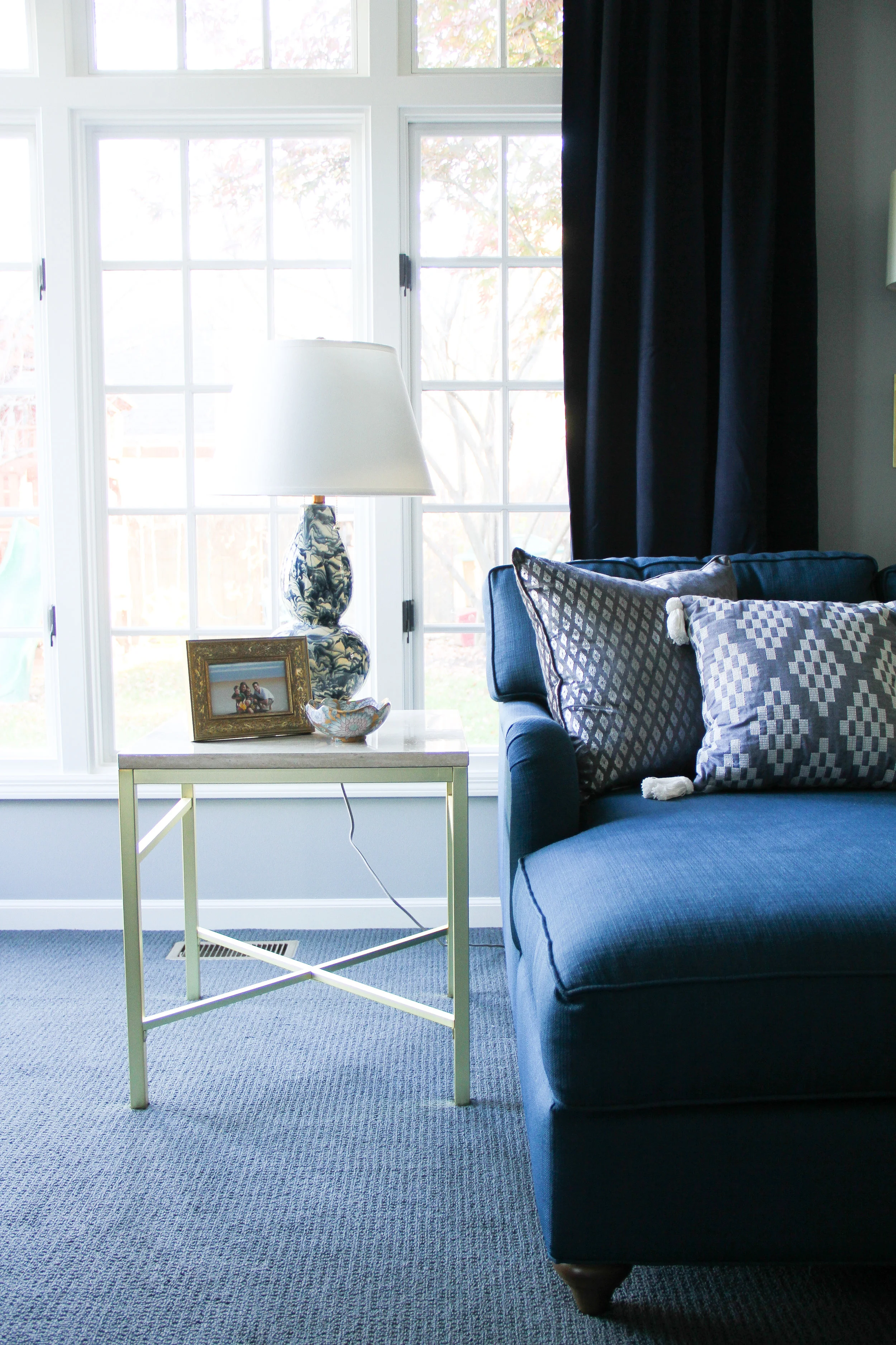
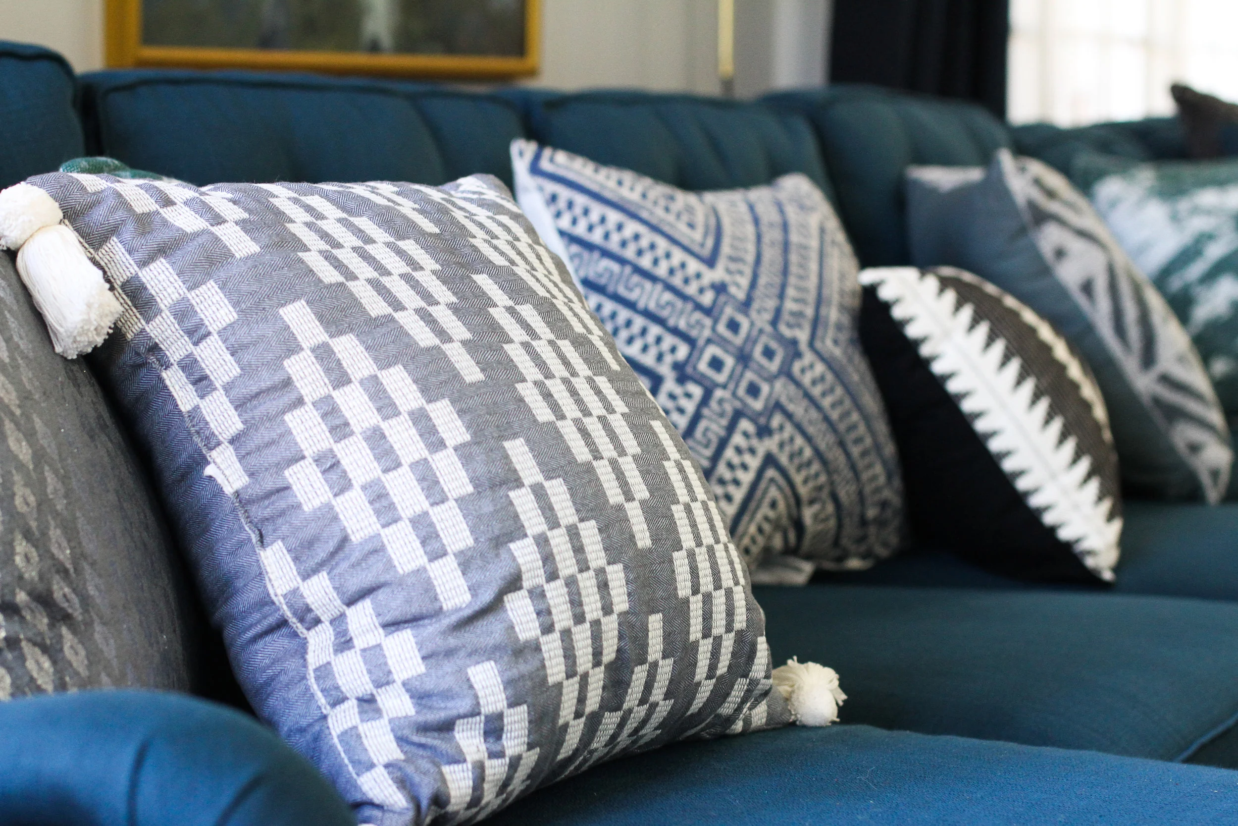
We had a custom sectional made by Younger Furniture, purchased through Hutch, a local furniture store. The button tufted cushions, english roll arms, and turned legs all give it that refined traditional look that works so well with the home, while the subdued burst of color from the teal upholstery keeps it fresh. And of course it’s incredibly comfortable.
The next big design element was the carpet. Removing, not replacing wall to wall carpet seems to be on most people's design agendas. But again, in a family room where comfort is king, you really can't beat the warmth and coziness of new carpet. After pouring over several samples in a range of blues and greys we landed on a charcoal from Karastan. It's 100% wool so the quality is excellent, and it's oh so comfortable underfoot.
I picked up the vintage hexagonal coffee table at an estate sale a couple of years back, completely in hopes that the right project would eventually come along. Despite its age the shape feels current, and the beautiful grain and detailing on the top are the real star. Possibly difficult to tell in the photos, but this is a big coffee table, just under 4' in diameter – so the scale is perfect with the large sectional. The warm honey wood-tone contrasts well with all the other cool greys and blues, and in a room comprised of mostly contemporary pieces, it's a welcome bit of heritage.
There was a moment when the sectional first arrived where Adrianne and Charlie briefly hesitated regarding having a coffee table at all; they'd grown to like the open spacious feel without. I decided to still place and style it, then let them think on it. After a few days I got the verdict, they were keeping it! And they had the most charming reason – they'd played a game that night with their three kids and every one had their own side to sit at. It felt like it was meant to be!
In addition to the room's length, one of the other major design challenges in the space was the lack of lighting. There wasn't an overhead fixture so table and floor lamps were pulling a lot of weight. I knew I wanted to keep the end tables the same on each side of the sectional and use matching table lamps. #symmetry Trying to also incorporate floor lamps seemed like too much. Streamlined sconces in satin brass, though... yes please! We added the Sonneman Palo Wall Lamps behind the sectional as well as on each side of the TV and the best part is they're plug-in so no messy electrical hardwiring required.
The adorably quirky sheep art was something Adrianne and Charlie picked out. When I first sent them my mood board it had an image of a pretty, but arguably generic abstract painting. They loved the idea of a statement piece on that wall, but really wanted it to actually hold some personal meaning for them. Serendipitously, while on vacation in Maine they wandered into a library that happened to be featuring the work of nearby artist, Jude Nickerson. They struck up a conversation with Ms. Nickerson, and despite having no previous distinct affinity for sheep, they grew quickly enamored with her pastoral depictions, and fond of the connection the painting would now have with their trip.
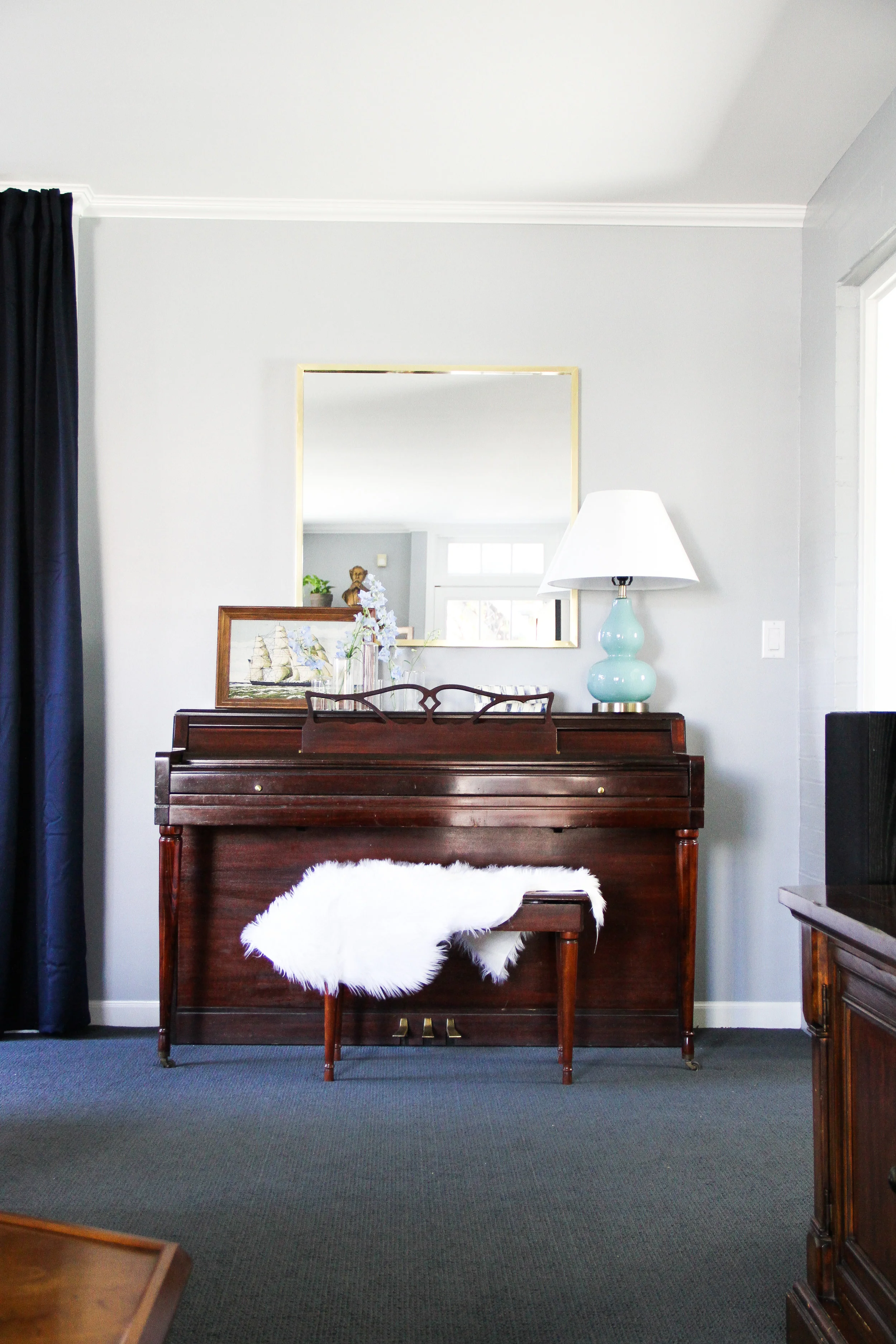
On the other side of the room the piano got a little styling update (because I never met a flat surface I didn't want to layer with all the things). Since the painting above the sectional was such a standout piece I decided to go simpler on this wall. A large brass square mirror works perfectly. Positioned straight across from the back french door it bounces even more light around the room and the streamlined brass perimeter is a nice tie in with the scones and other gold touches throughout.
I'm so happy with how this space turned out and even more so with Adrianne and Charlie's excitement! It's now the perfect room to snuggle up for family movie night, or leisurely lounge, book in hand, on a sunny and slow afternoon.
Here's one last parting Before/After to highlight the transformation:
* Photos by Bethany Gilbert


